Missouri Ridge Bourbon
-
Brand + Package design
-
Creative Direction
-
Illustration
-
Lettering
-
Strategy
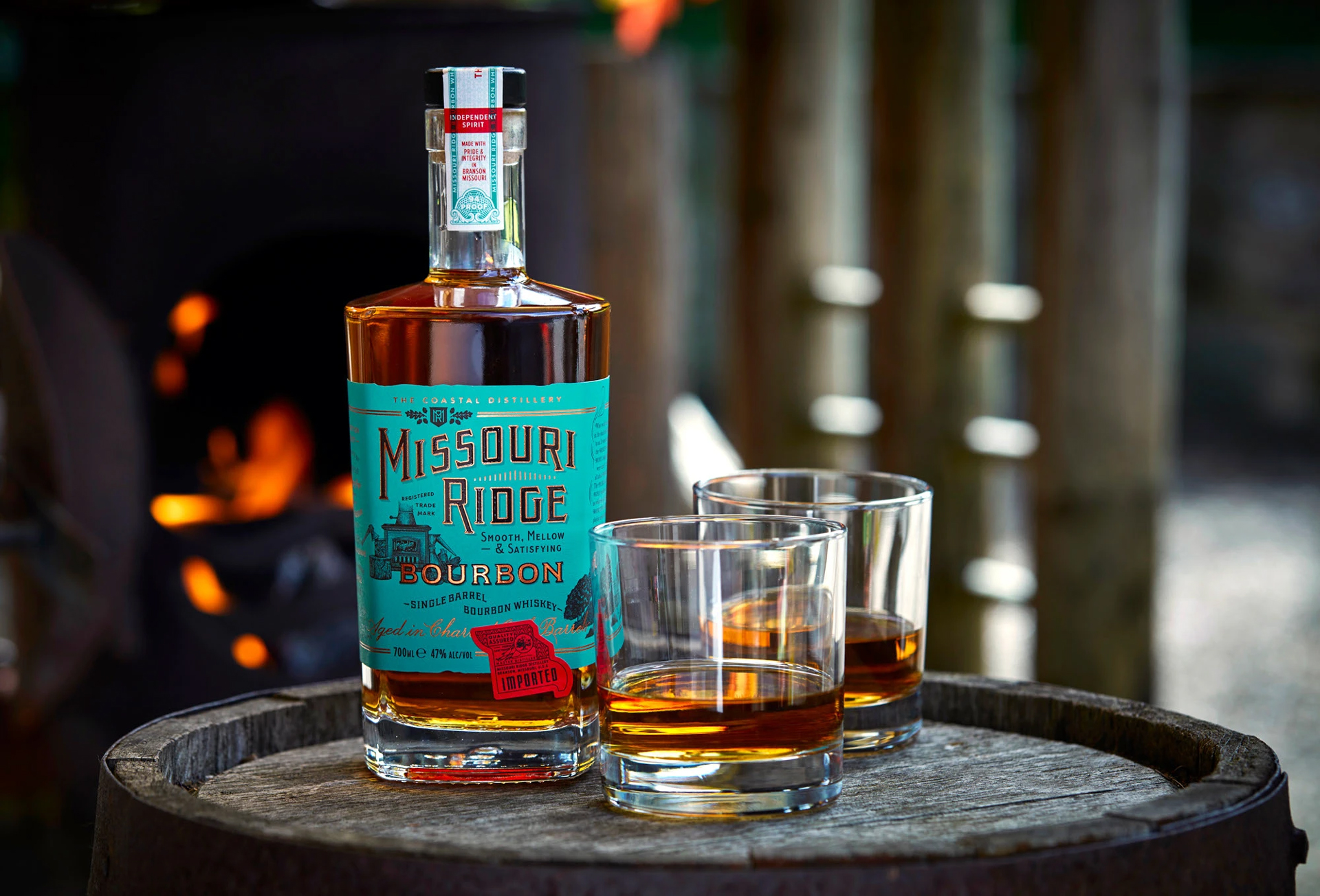
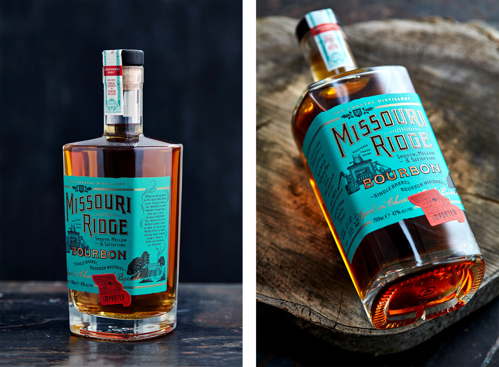
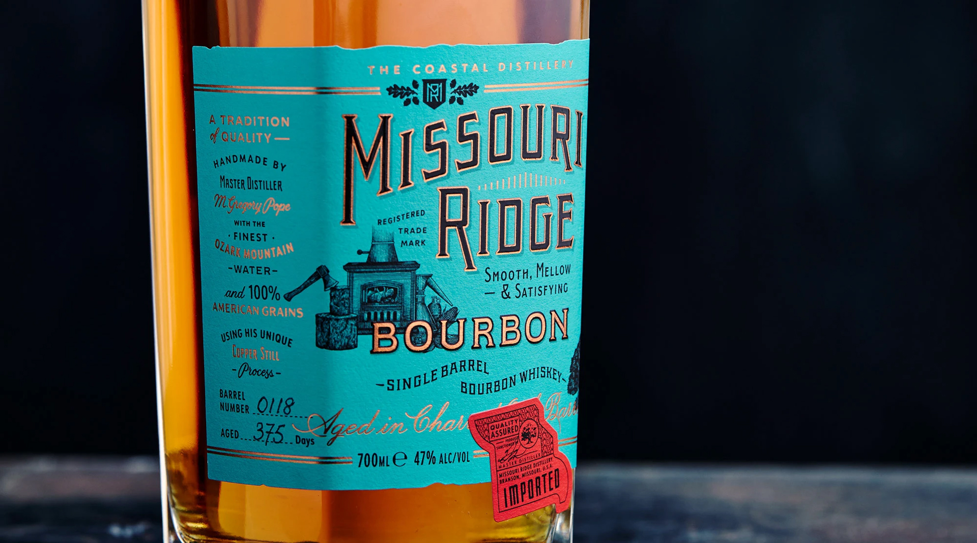
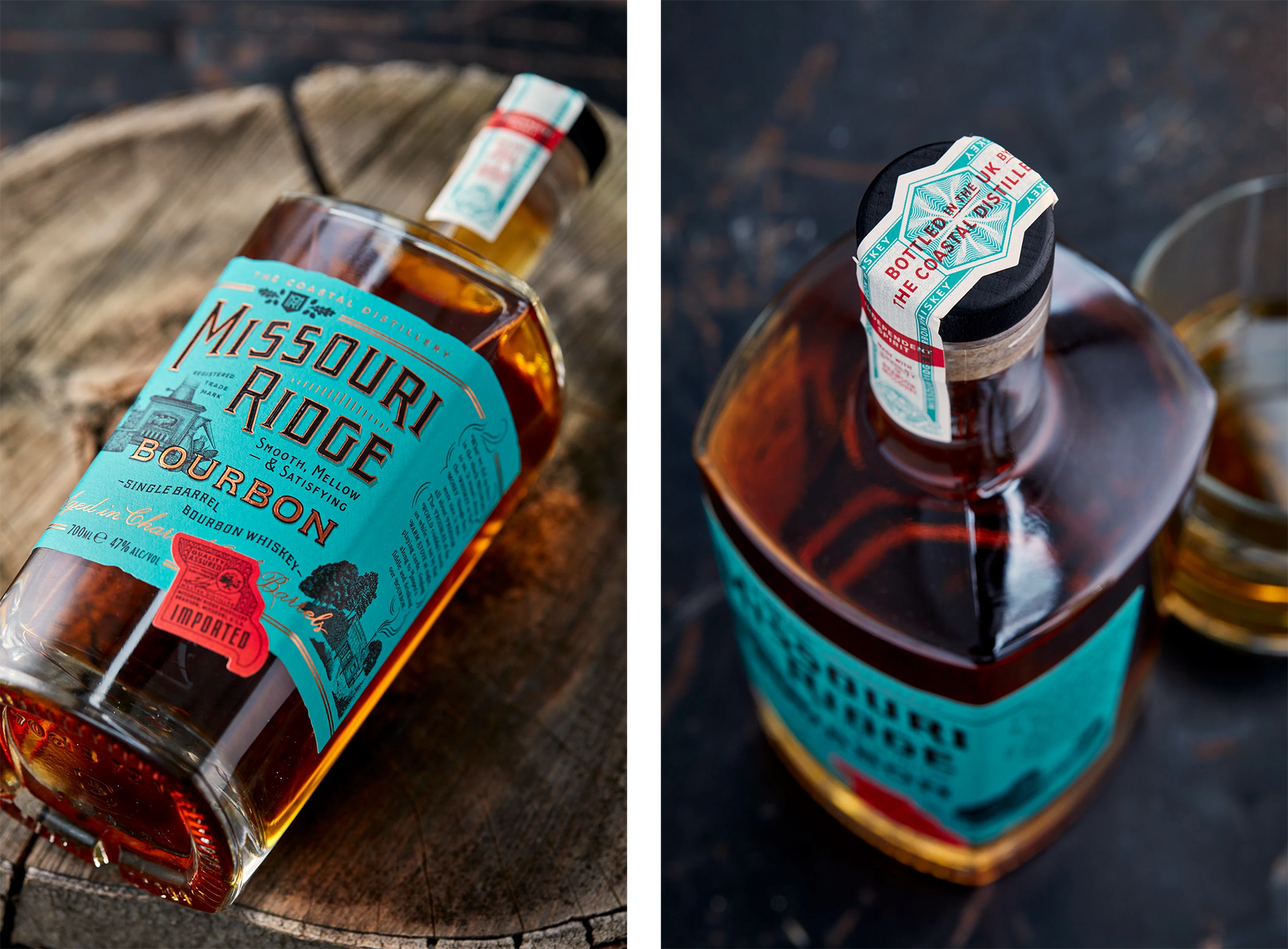
With the spirits shelf more crowded than ever, this bourbon needed a label with its own character, something that could catch the eye and quietly tell the story behind it. The copper still process perfected by master distiller M Gregory Pope became the foundation, with copper linework and a deep green field drawn from the patina of aged copper. It’s a design shaped by the materials and the heritage rather than surface flourish.
Handcrafted lettering and illustration carry that same sense of care, echoing the way the bourbon is made from natural ingredients through to its time in charred oak. At the centre sits a small woodburning stove, a nod to Pope’s grandfather who once ran an illicit still and passed down his recipes. The label gives the bottle a sense of lineage and craft, something honest and rooted.