Grey Goose Asset Development
-
Lettering + Illustration
When Intertype Studio began exploring ways to refresh the Grey Goose Vodka brand, they brought in a lettering and illustration specialist to help rework the core visual assets. The brief was to test new directions and refine the brand’s expression for a contemporary audience while keeping hold of its established heritage. Creative director Asa Cook led a fluid, exploratory process, developing and narrowing ideas until a clear direction emerged.
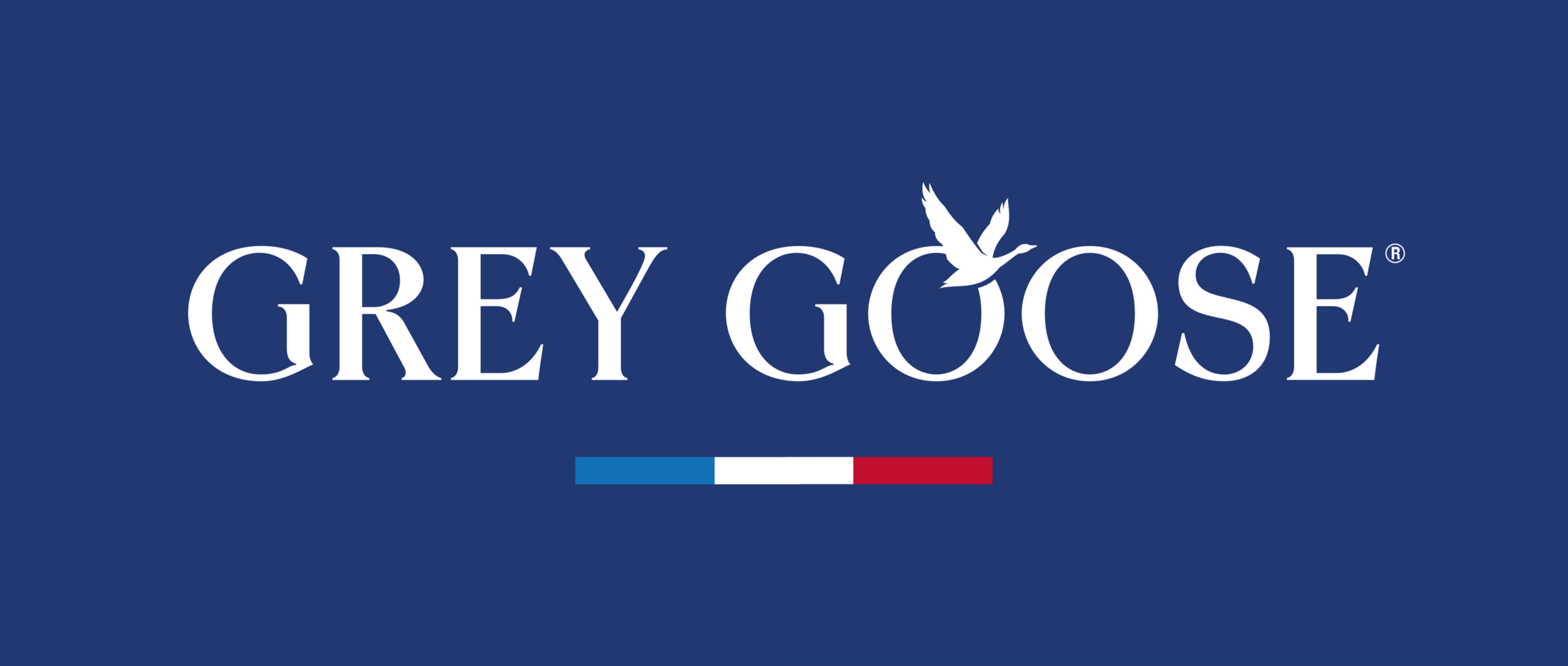
The logotype became a key focus. Introducing stronger contrast into the letterforms added character and recognisability, most noticeably in the capital G, giving the mark a sharper sense of identity. The supporting illustration and lettering were crafted specifically for the refresh, adding nuance and individuality without losing the clarity and elegance that define Grey Goose.
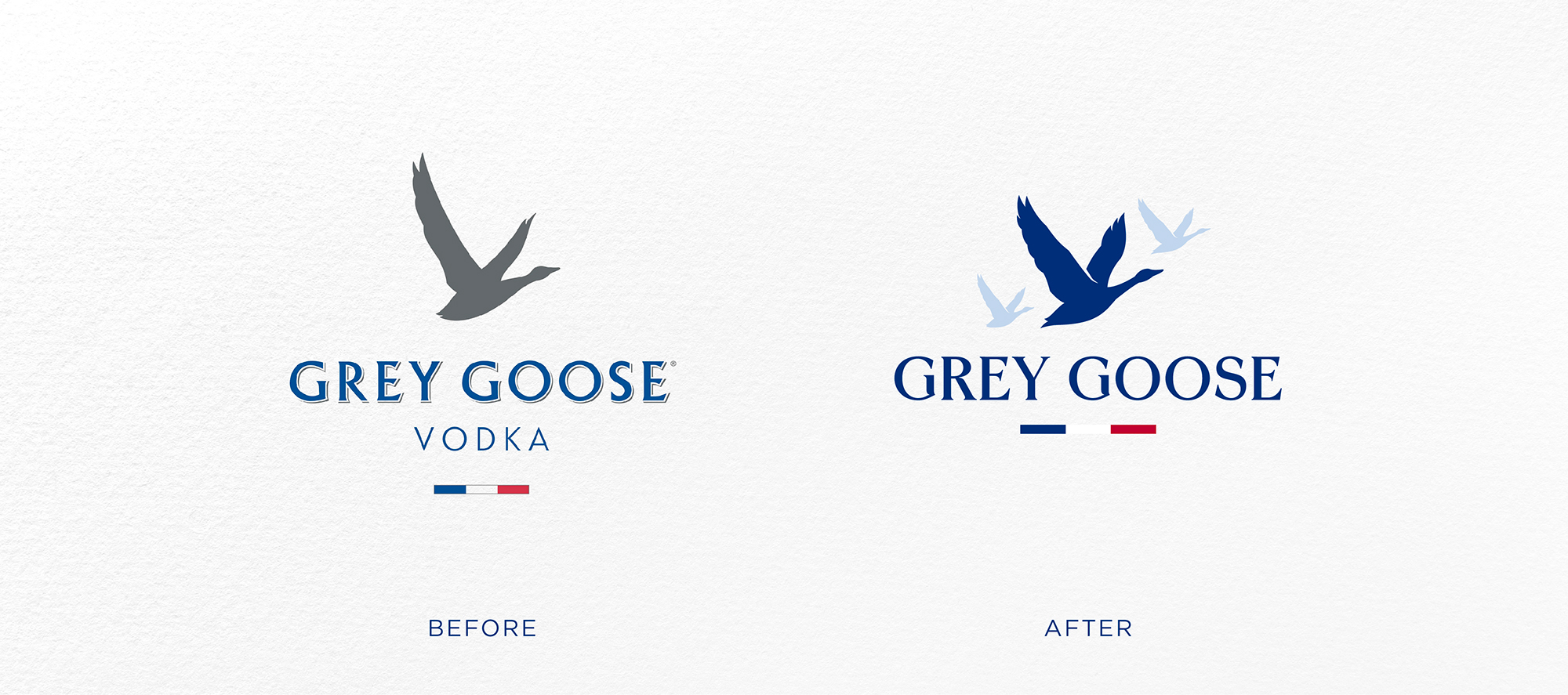
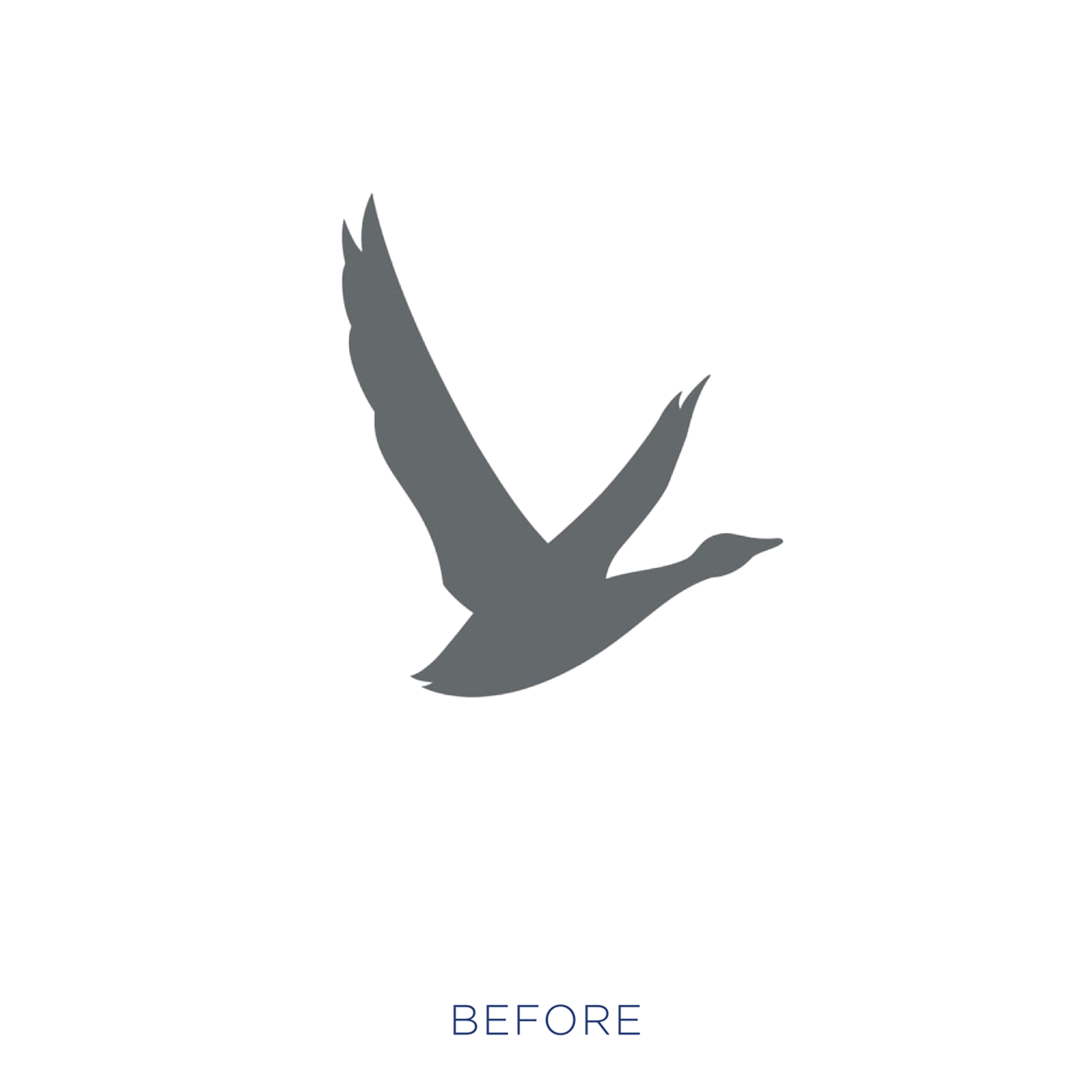
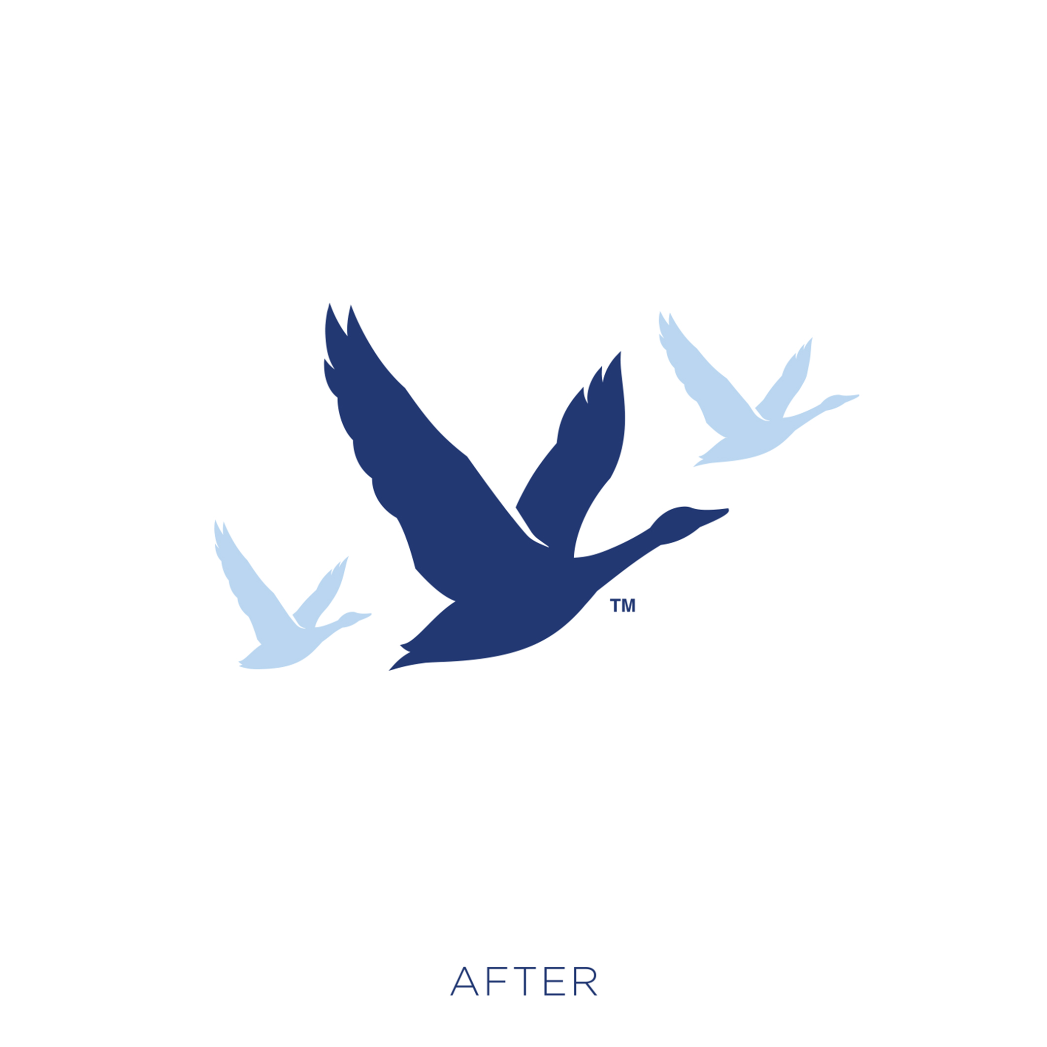
In recent years, brands have simplified their iconography, however with Grey Goose we added greater depth and detail to the brand’s famous goose silhouette. The wings are more defined, their intersection with the bird’s body has been reworked, and its torso has been thinned to create a silhouette that is more elegant and lifelike. The goose’s form has been subtly introduced to the logotype. Asa observed that you never see just one goose on the wing, so we worked on a secondary mark with two additional birds in the background, bringing greater depth to the visual identity.