Missouri Ridge Bourbon
Craft distilleries seem to be taking over at the moment, and a real challenge for anyone in this market is to make their products stand out from the rest. When Alex Hull from Coastal Distillery got in touch to talk about label designs for a new premium bourbon the company is importing to bottle in the UK for the European market, making it distinctive and appealing was central to the brief.
Missouri Ridge Bourbon has already been winning awards in the US for its flavour and quality, but for me it was important to look at where it comes from, how it’s made and who’s behind it. Understanding these things made it possible to design this label scheme, which everyone says is one of the best I’ve ever created.
Researching the product
Before starting any design work, it was important to thoroughly research the bourbon market and Missouri Ridge Distillery’s background. Lots of information about the company was sent across by Alex at Coastal Distillery and working with copywriter Garrick Webster I deepened that out by finding out more about Branson, Missouri, where the distillery is based. We looked at the history and geography of the area, local industry, moonshiners, Ozark culture, Prohibition and more. Jim Beam and Jack Daniels have a certain mythos surrounding them, and when we found out that master distiller M Gregory Pope has developed his products from family recipes handed down by his grandfather, a moonshiner who made liquor on a wood stove still in the basement back in the day, that was gold dust for this brand.
Thematic routes
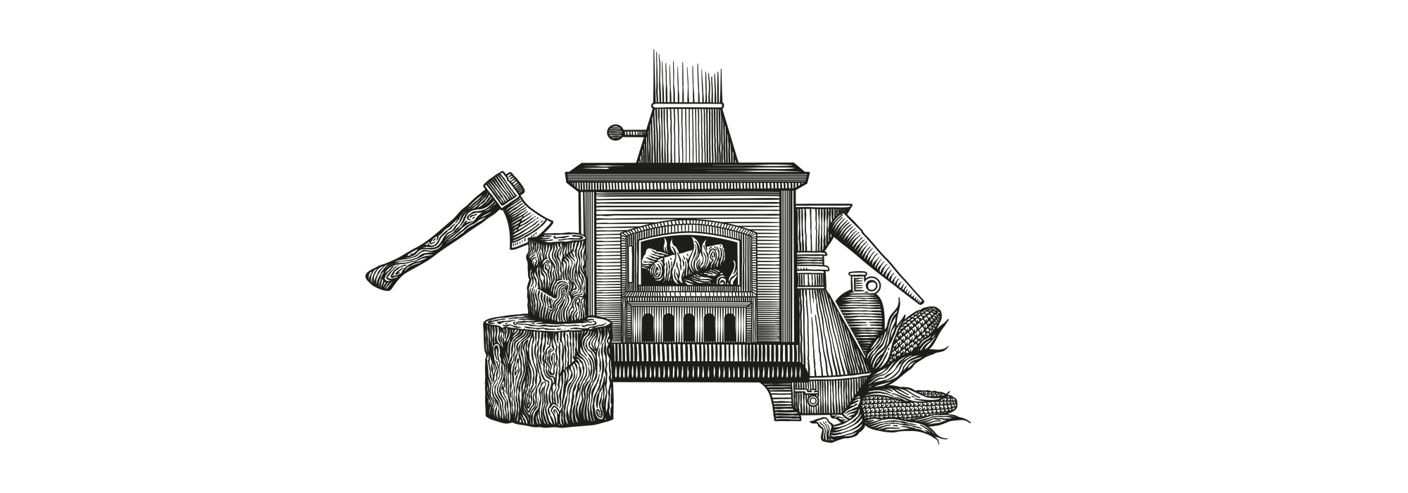
Bringing all this background information together, we were able to reduce everything to four main concepts, each of which had the potential to inform the visual approach. First there was the wood burning stove, linking Pope’s grandfather to notions of independence and self-sufficiency. Our second concept was ‘a song for the Ozarks’, tying in to the musical heritage of nearby Branson, Missouri. Thirdly, there was M Gregory Pope’s distilling prowess. Our fourth route was to base everything around the Ozark Mountains. We thought the wood burning stove was the strongest route, and Costal Distillery agreed. It’s different, and had the capacity to draw in elements from the other routes at the same time.
Planning the label
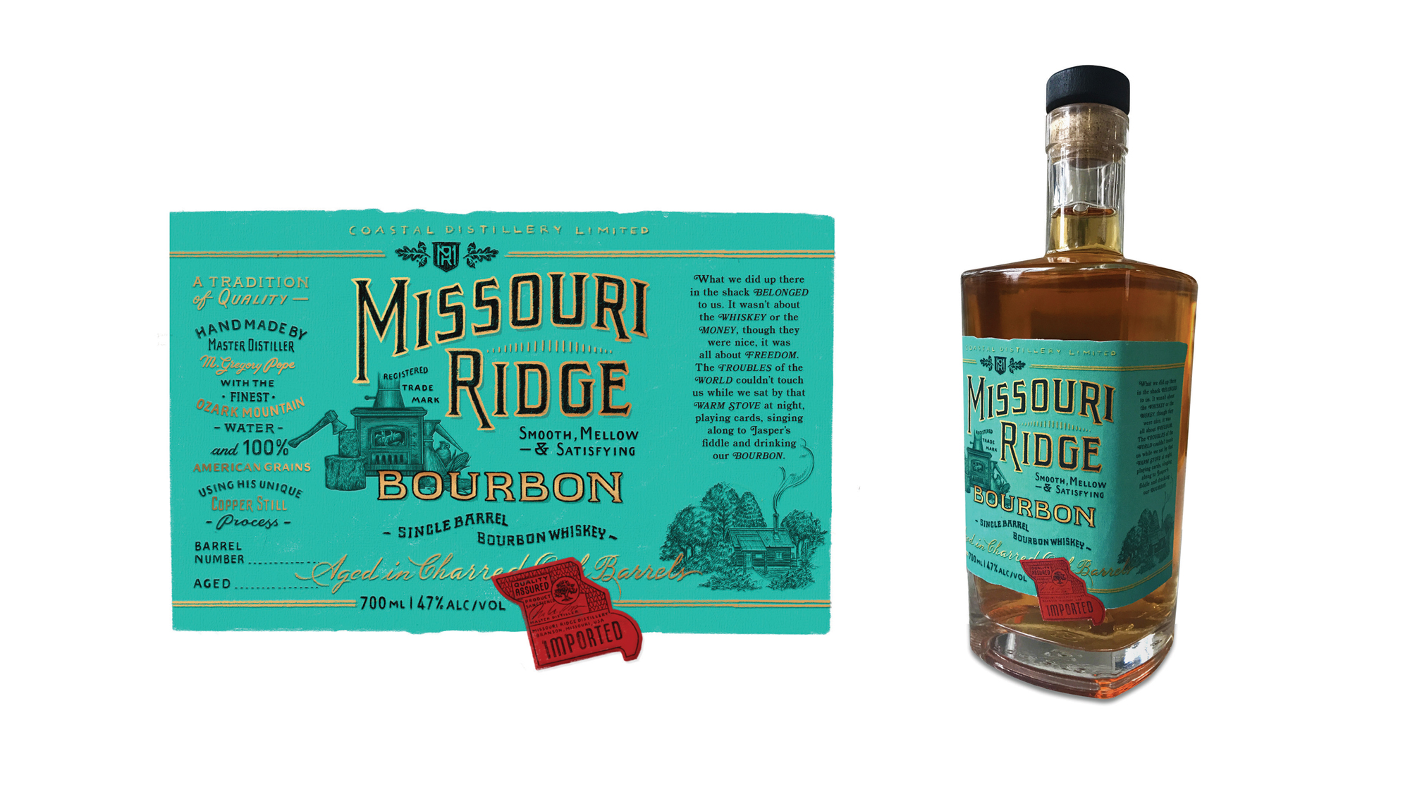
The label had to communicate a lot of information about the product, and to do this we needed more than an illustration of a wood stove and some lettering. After creating some preliminary sketches for approval, we focused on the information hierarchy on the label. What would we say about the product and where would we say it? I asked Garrick to suggest various copy elements and began putting them together. The key points included a description of the flavour, the quality of the ingredients used, the unique distilling process as well as little statements that would capture the tradition behind the bourbon and create an atmosphere around it.
Label design
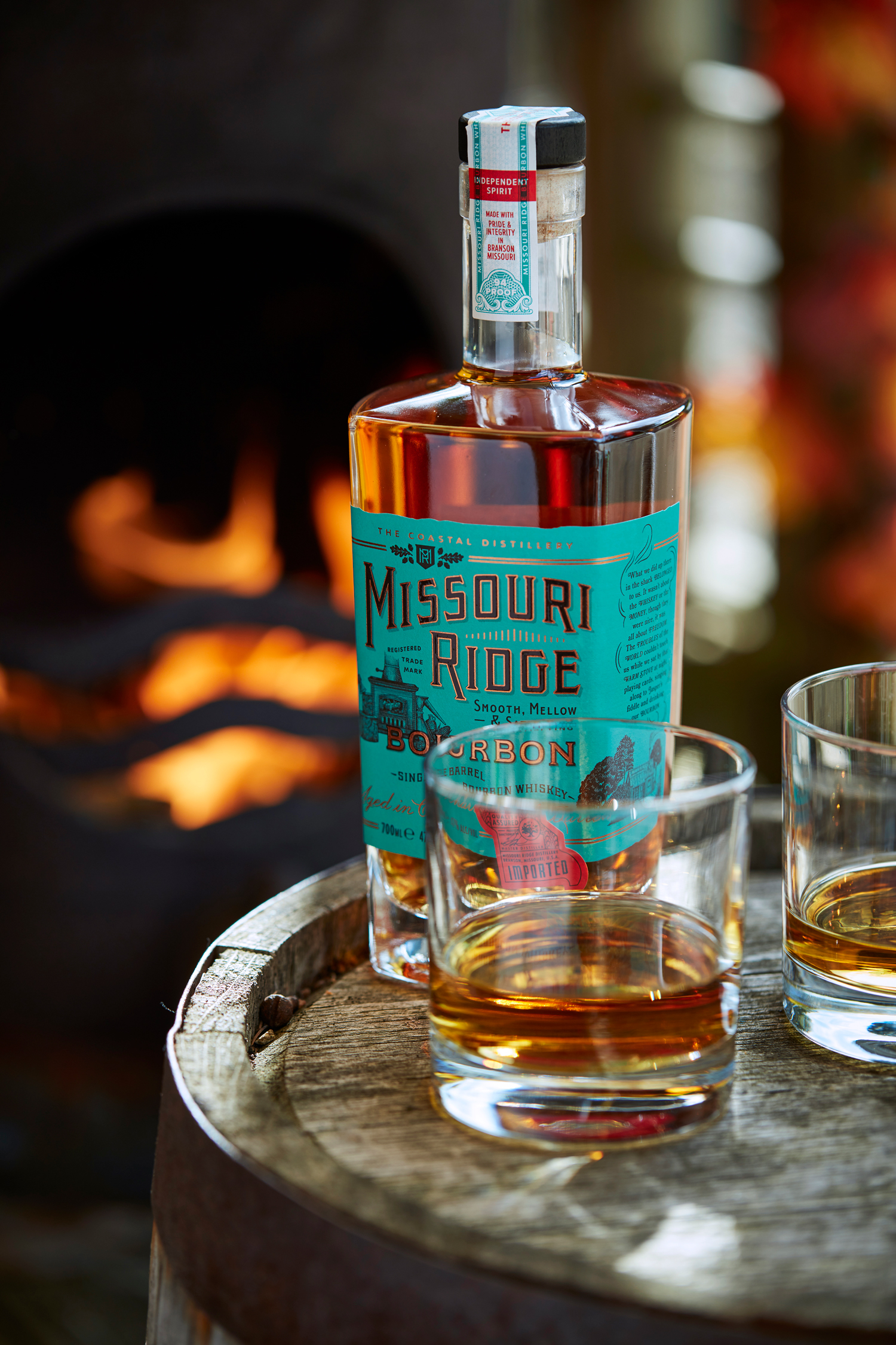
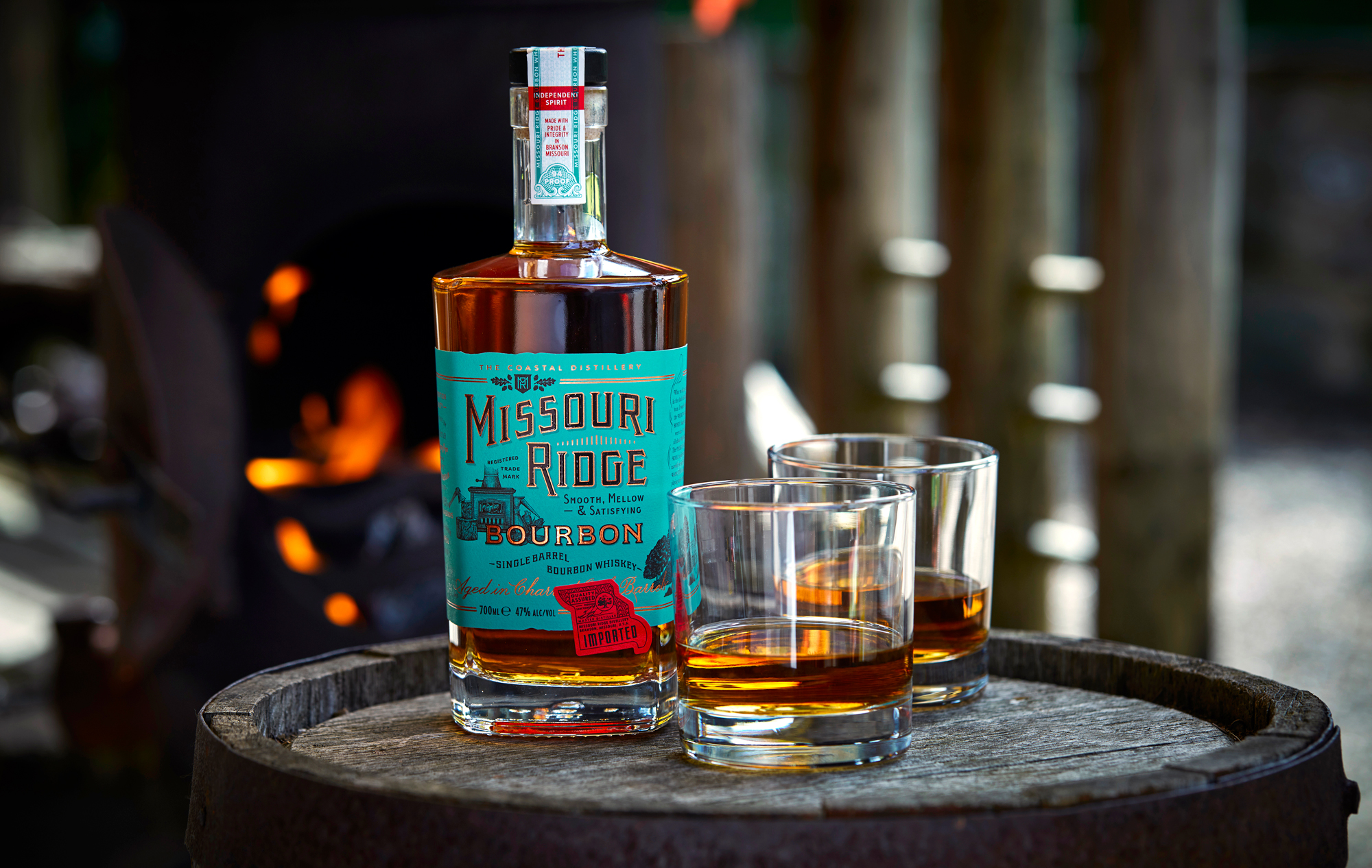
The loose label designs that I sketched on paper and on my iPad began to coalesce and from outlines of the main logo and text elements I moved on to drawing everything in detail and tightening up the layout. The word ‘Missouri’ has a smooth curve to it, with some vertical hatching between it and the word ‘Ridge’, suggestive of the Ozark geography. The hand rendered lettering harks back to 1920s type, evoking the Prohibition era, and the illustrations have a vintage etched look.
Distinctive colours
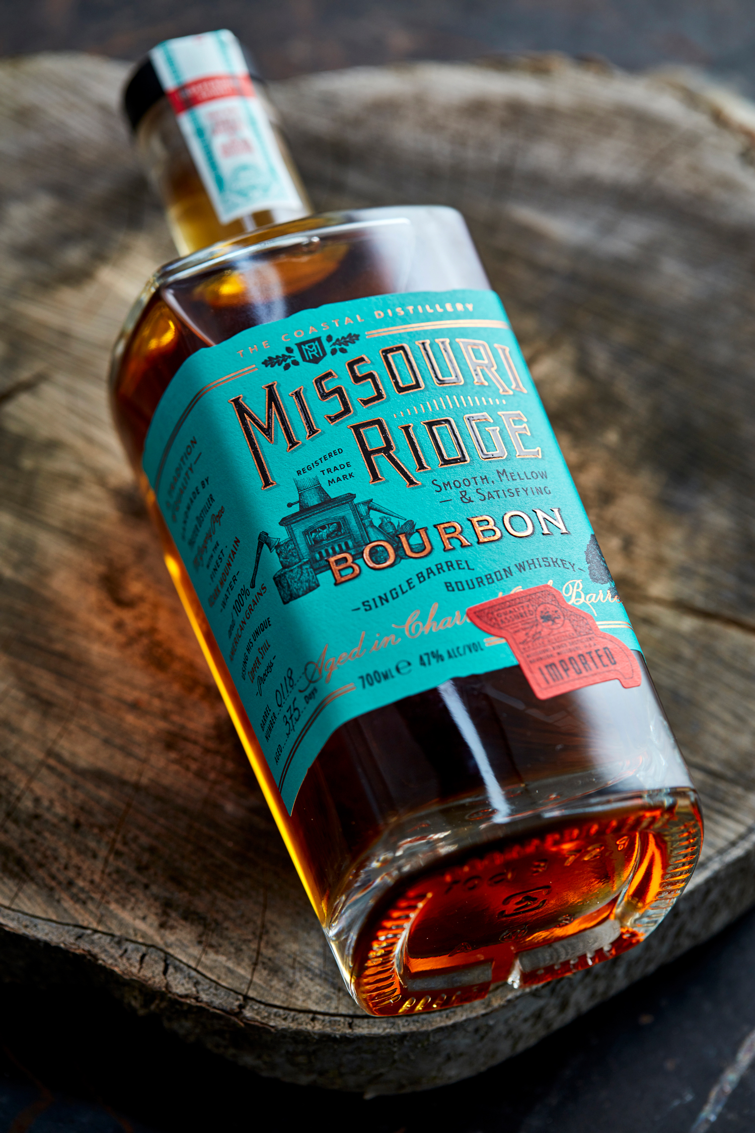
What gives Missouri Ridge Single Barrel Bourbon its smooth, mellow flavour is the copper still used to make it. This was designed by M Gregory Pope as he refined his whiskey-making process, and it got us thinking about copper and its properties. To tie the label into the product and how it’s made, not only have we used copper foil for key lettering on the label but the background colour is the same greenish hue as the copper sulphate/carbonate patina that forms on an old copper roof. It’s a subtle connection that also distinguishes the label away from the cream and maroon schemes used by American whiskeys these days.
A touch of authenticity
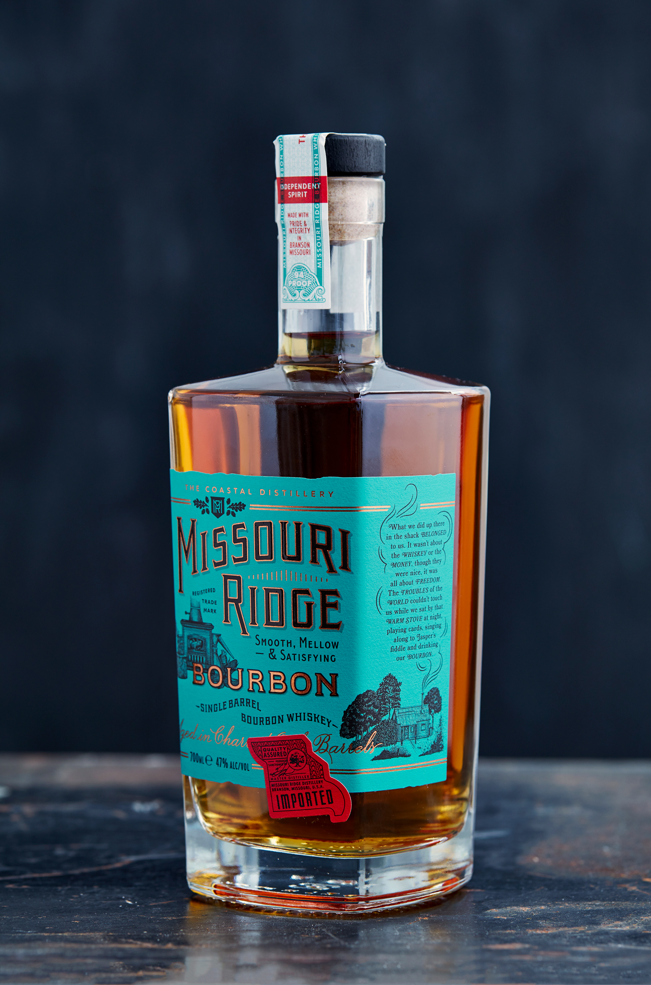
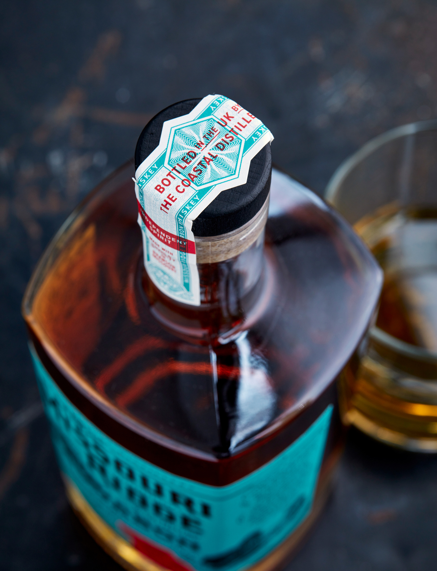
Clients often work with me to give their packaging an authentic touch, but it’s not just the hand-rendered type that does this. On this label, I’ve used a red device inspired by the duty-paid seals that post-Prohibition distillers would put on their bottles to prove they were kosher. This device has been turned into a seal of quality with M Gregory Pope’s signature. As a sticker on the bottle it breaks up the symmetry of the label nicely. On the right hand side of the bottle is a quotation written to capture the atmosphere of a moonshiner’s cabin, with the text written in the smoke rising above the stovepipe. And, there’s an area on the left of the bottle where the barrel number and age of the bourbon can be written in after bottling. This demonstrates the care and craft that goes into it.
A unique bottle
It’s all capped off with the highest production values. The production and printing were handled with Alex at Coastal Distillery, an expert with label stocks and special finishes. The paper has a soft texture to it, and the main lettering is in high build black varnish with a copper outline, enhancing its tactility. The bottle itself wasn’t our first choice, funnily enough, but has worked out better in the end. Its got hard, square shoulders just like an Ozark moonshiner, and its taper takes it away from the straight square forms of standard bourbons. We tweaked the label’s dimensions to work with the taper for an eye-catching finish. Finally, I had the bottle samples photographed in a cabin with a real wood stove blazing to set the perfect tone for this product.
“The way Tom took a brief conversation and researched and crafted this is quite something, demonstrating a tapestry of skills and abilities. The end result gives us real confidence when we meet with spirits buyers – we are presenting an exceptional bourbon in exceptional packaging that is quite different from competing products.”
— Alex Hull, Managing Director, Coastal Distillery
