Coastal Distillery
After Ginger Monkey Design created the packaging for Missouri Ridge Bourbon, its UK importer Coastal Distillery invited us back to rebrand the entire outfit.
The existing branding, developed when the company was founded in 2017, was clear and functional – created to work well alongside the company’s by-hand bottling and labelling system. The business has a very modern approach to distilling, with state-of-the-art stills, and didn’t want to be lumped with the traditional look of oversaturated craft distilling market.
Coastal Distillery wanted a more individual brand with a premium feel, giving them layers and nuance to help tell a deeper story for greater traction with both consumers and the spirits trade.
Authentic storytelling
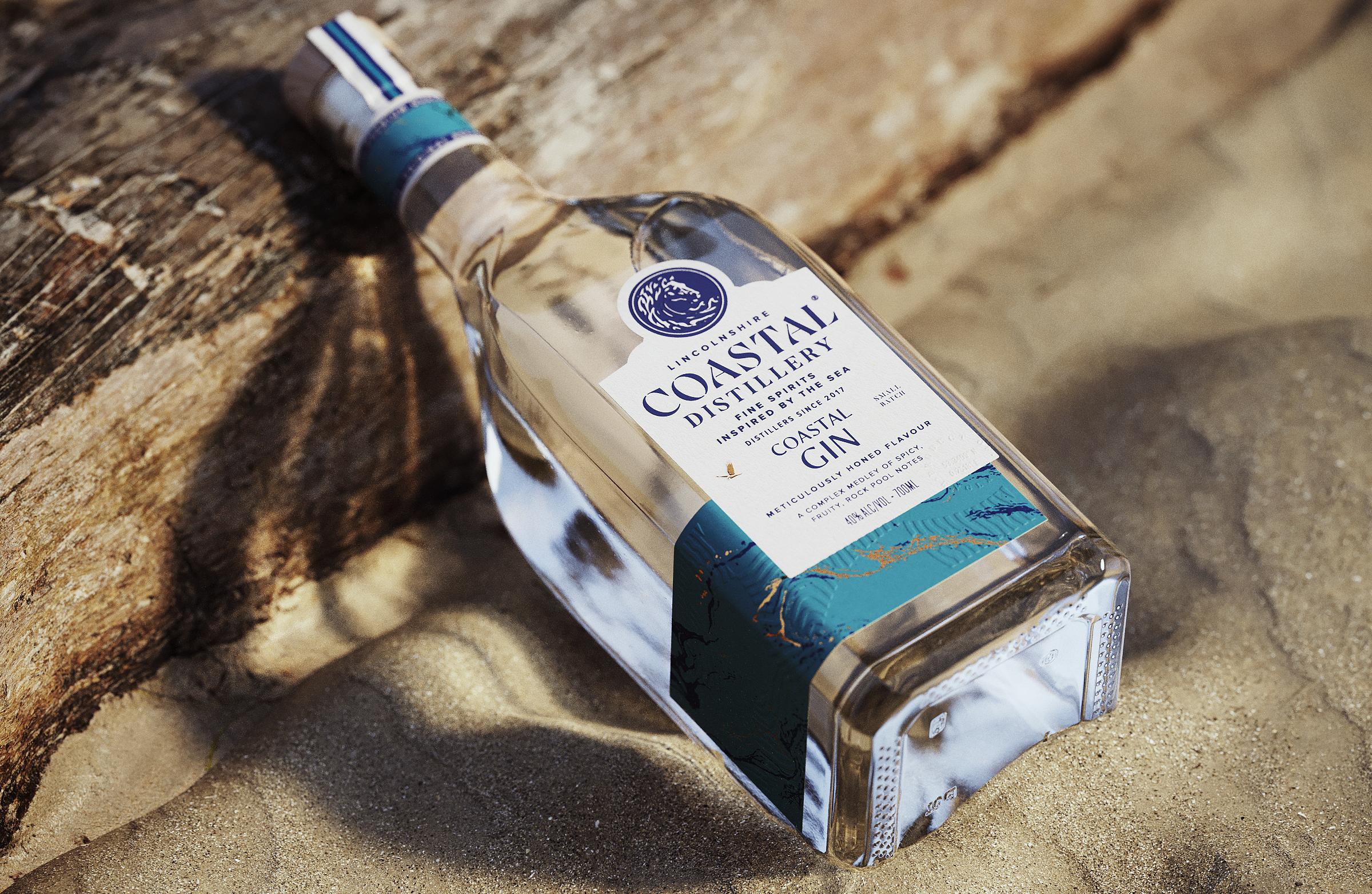
‘Authentic’ is a much-overused buzzword in branding, but it really does apply with Coastal Distillery. The company’s core product – Coastal Gin – is literally inspired by the Lincolnshire coastline where the distillery is based. The gin is infused with blackberries, sea buckthorn berries and bladderwrack seaweed, as you’d find on the sand dunes, for its unique coastal flavour.
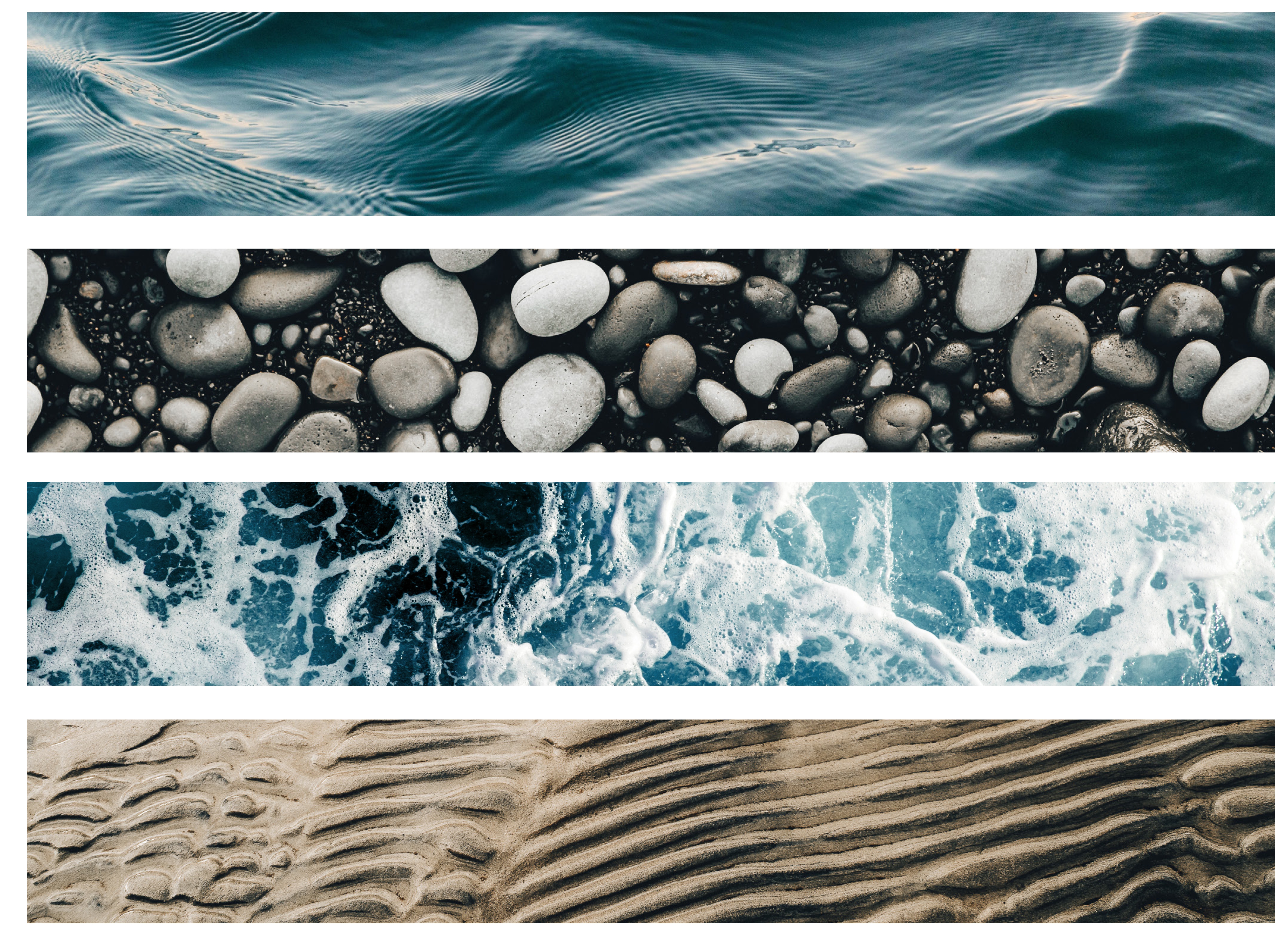
This was an excellent foundation to build upon. We set out to deepen our understanding of the lived experiences, aspirations and culture of people living on this stretch of the British coast – now and going back through the centuries. Visiting the area, we explored its seaside and rural communities, discovering its energy, resilience, endeavour and natural beauty, taking inspiration from the timeless conflict between the two elemental forces – land and sea – that defines the coast.
Visual meaning
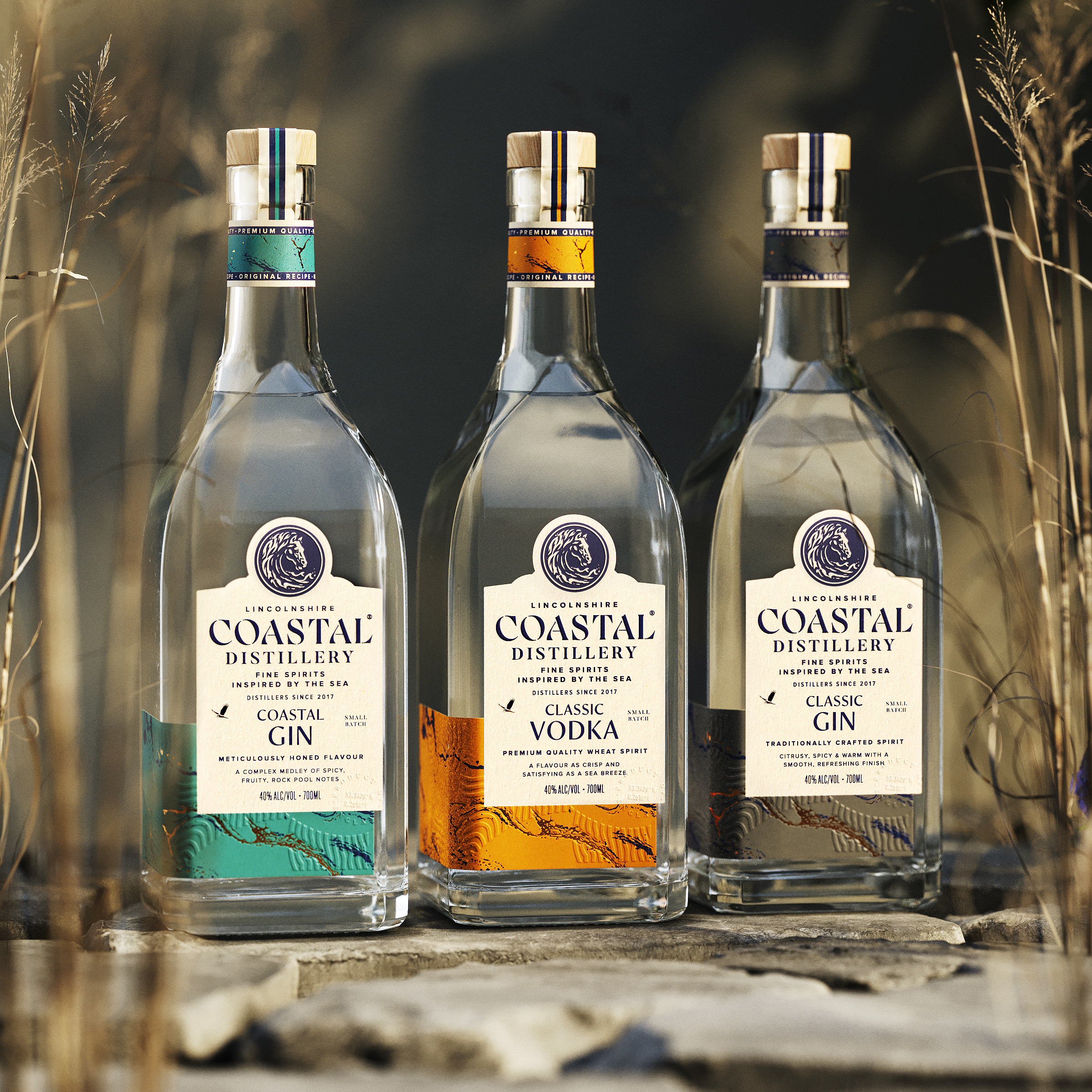
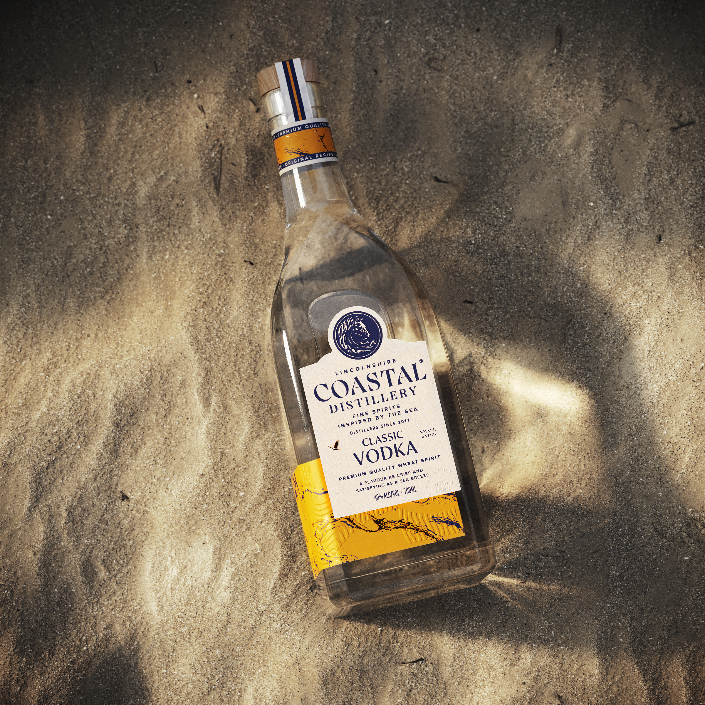
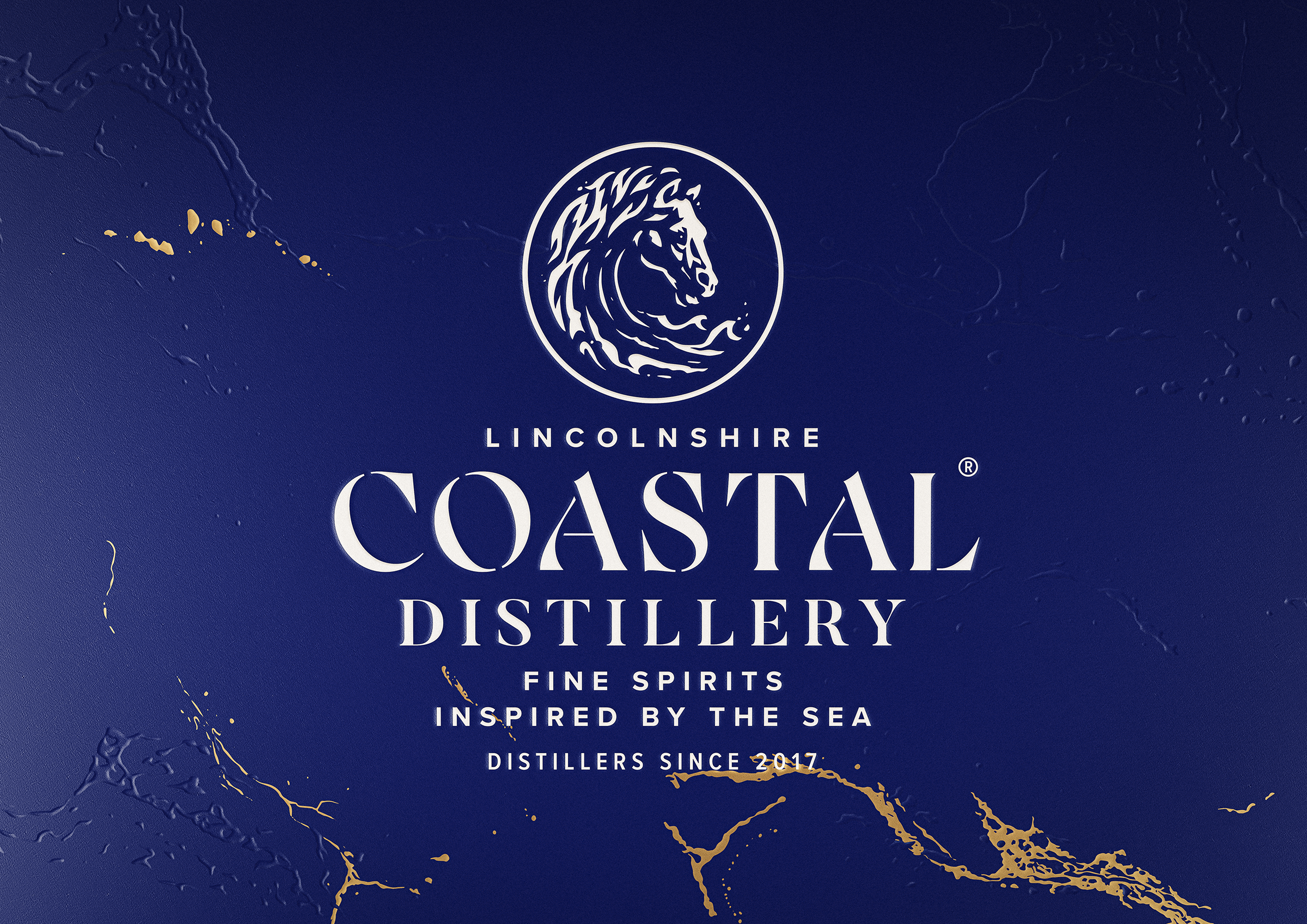
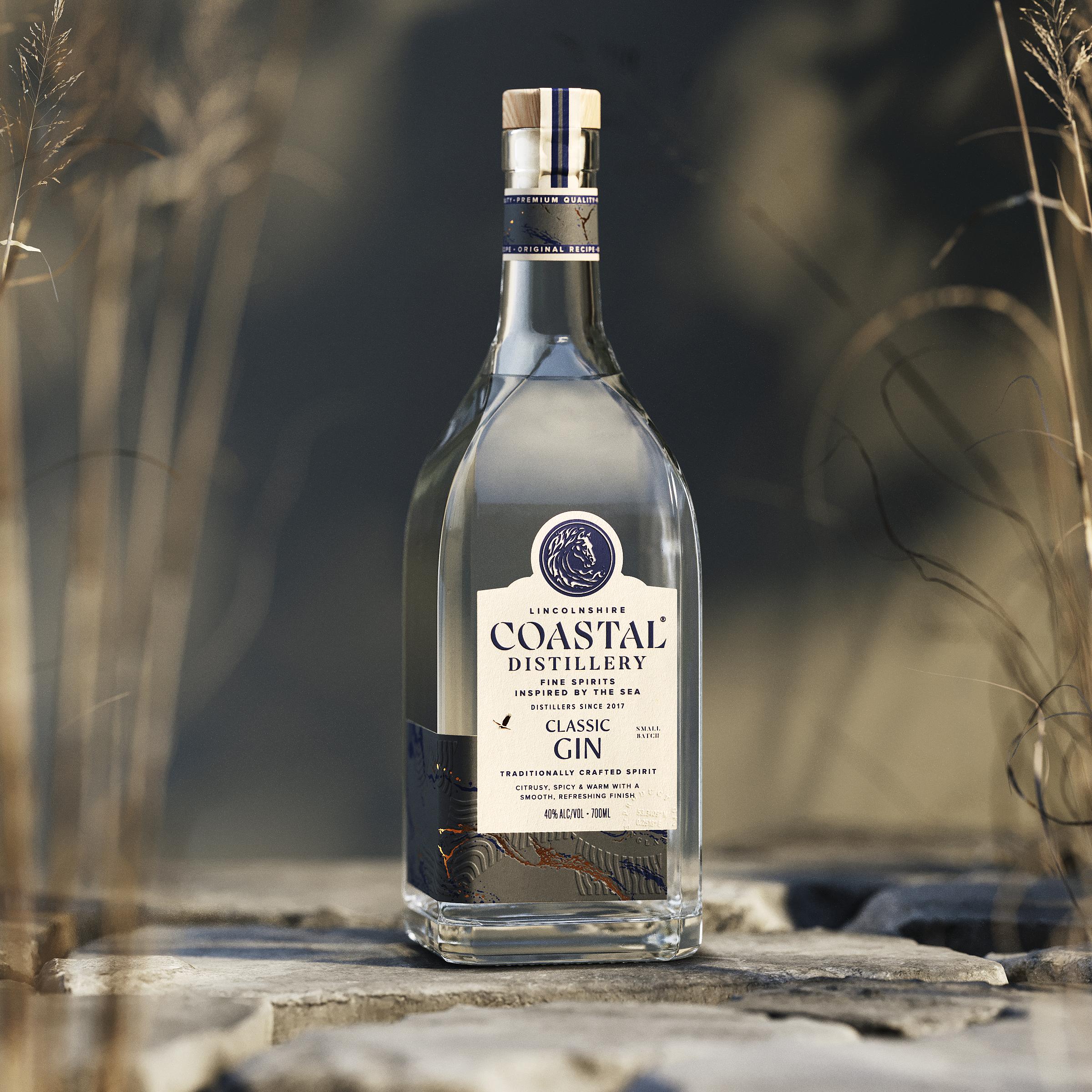
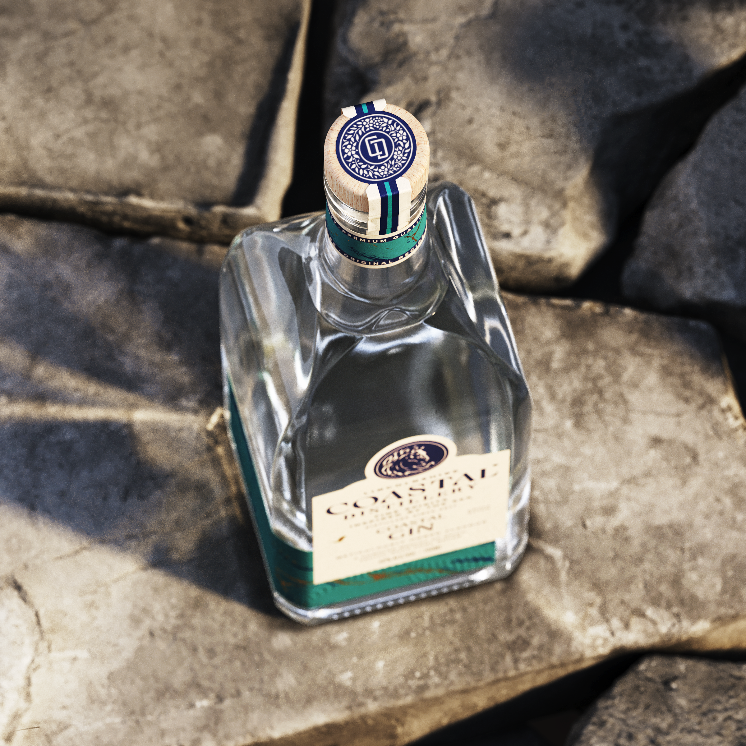
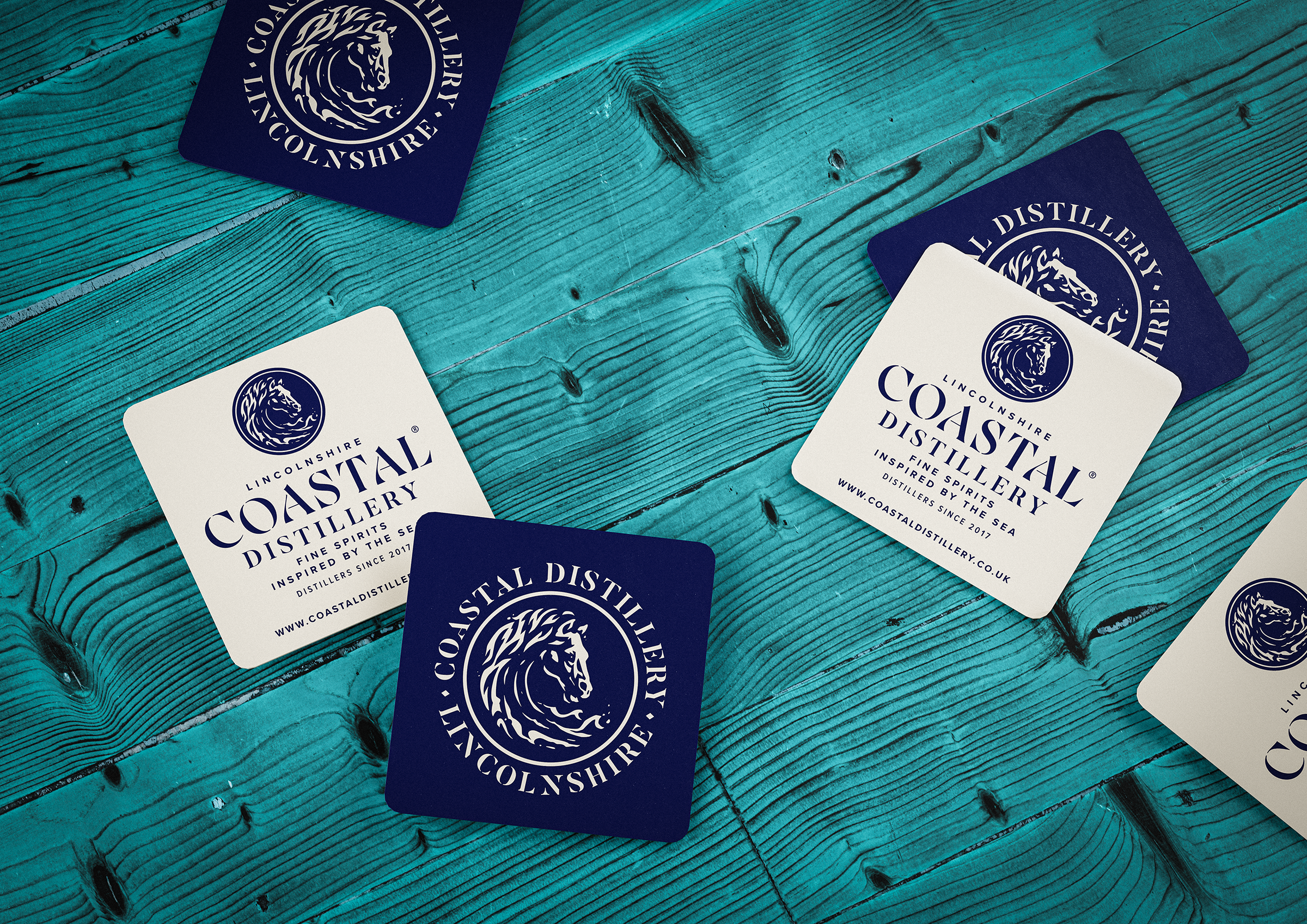
The power of huge waves crashing into the shore are a metaphor for the energy and dynamism of the new brand we created. To capture this part of the narrative, we developed a horse’s head composed of waves as a central icon with illustrator, Nick Molokovich. This singular, powerful image forms a focal point within the label that can be used across Coastal Distillery’s collateral.
It’s an image that avoids many of the visual cliches in the gin category, and subtly illustrating further layers in the Coastal story. The logo was inspired by the white horses that sailors say pull Poseidon’s chariot. Meanwhile, across Lincolnshire horses have always been important in agriculture. It’s a creature that bridges themes of land and sea.
Meticulously honed logotype
Like the white horse logo, the new logotype references a place where the land meets the sea. Drawn by hand, the lettering is modern and elegant, befitting an upscale spirits label, but it is also reminiscent of the stencilling on crates and barrels at the ports dotting the Lincolnshire coast from Grimsby down to Boston. This distinctive, bespoke type elevates the new brand above the old and differentiates it from other gin brands locally, nationally and internationally.
The typography is clean, clear and contemporary, with greater hierarchy given to the copy elements.
Texture, tactility and detail
To enhance the perceived quality of the product, the standard round gin bottle has been replaced with a tall, four-sided bottle – the structure reminiscent of the Norman churches found in the villages along the coast. The label has been given a unique form, with a consistent system applied across the core products – Coastal Gin, Classic Gin and Classic Vodka – so that the range is extendible in a cost-effective way.
Product differentiation is supported through colour-coded neck bands and swashes that wrap laterally to the left. These are emblazoned with natural wave and sand patterns, highlighted through the use of block foil and embossed textures for a premium finish. A foil marsh harrier makes a lovely detail on the label, understated but hinting at both the wind and wildlife of the area. All of this is rounded off with a wood and cork stopper for a touch of organic texture.
A telescope to the future
Ginger Monkey Design has worked closely with Coastal Distillery to ensure the new branding and packaging system has the flexibility to incorporate future products. We’ve helped them to rationalise product lines that include the core spirits, a heritage range (including the successful Dam Raider Gin and Mosquito Vodka) and speciality liquors such as Missouri Ridge.
In future, flavoured spirits and liqueurs will be introduced, carrying on the coastal theme through their naming and label design.
The brand book we created for Coastal Distillery includes tone of voice guidance, and a guide to using photography so that it supports the coastal experience conveyed by the brand. We will continue to work in partnership with Coastal Distillery on their branding, marketing and communications online, in print and via social media.
“I can’t emphasise enough how proud we are of the brand Ginger Monkey Design has created for us. It really is remarkable and it gives us a much stronger proposition with younger consumers who find us online, retail channels, the trade and potential contract partners.”
Alex Hull, Managing Director, Coastal Distillery
Take a trip to the coast…
www.coastaldistillery.co.uk
Credits
Creative direction & design by Ginger Monkey, Tom Lane
Copy & research by Garrick Webster
Bottle visualistions by Boo BY
Icon illustration by Nick Molokovich