Fósforo Mezcal
-
Brand + Package design
-
Illustration
-
3D
-
Creative Direction
-
Lettering
-
Strategy
Mezcal: a hot property
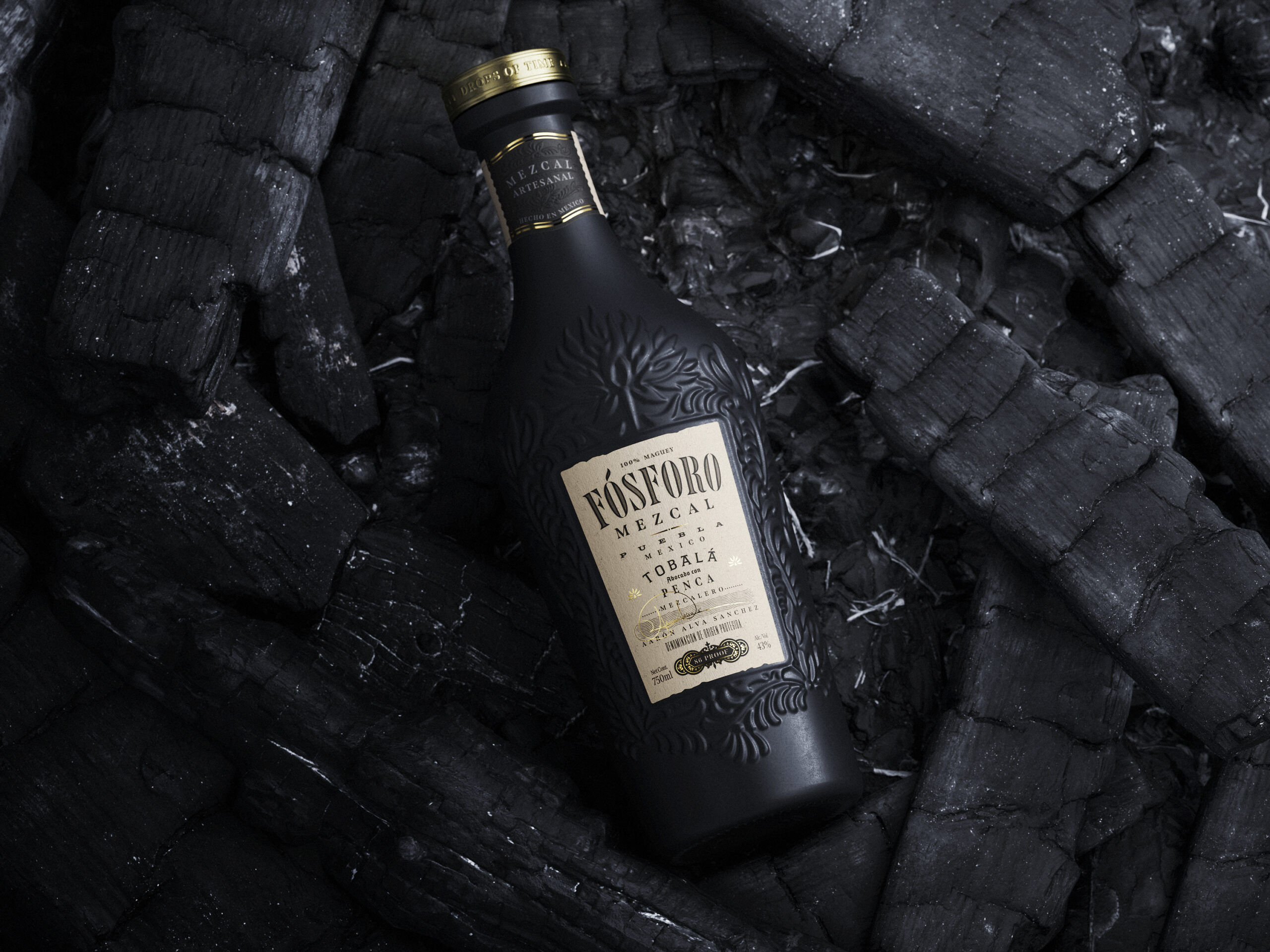
This was our first mezal but our research was helped by great communication with our clients. We set out to understand how mezcal is produced, its history and the cultural context in which it is made. Then we zeroed in on the Puebla region of Mexico to understand more about the people, the terrain and the palenque where Fósforo is made.
Mezcal has become the next big thing in the US, so we needed to find out what the competitor mezcal bottles and brands look like. We investigated the positioning and presentation of different brands – there was clearly an opportunity for a premium product.
Drops of Time
Through our research we identified the key themes relating to Fósforo that would differentiate it from competitors and elevate it to luxury status. This formed the basis not just for the language around the brand, but its entire look and feel. We developed and articulated two concepts:
1 Time – The time it takes to create the perfect mezcal, the history of the mezcalero family producing Fósforo, and the wider history of mezcal distilling.
2 Flame – Fósforo is Spanish for match and our clients’ brand name connected with the roasting of the maguey and the smoky flavour of Tobalá mezcal.
We progressed the Flame and Time themes and wrote a narrative leading with the evocative image of the flame and its link to the flavour, supported by the idea that each drop of Fósforo represents a Drop of Time.
Developing Fósforo’s graphics
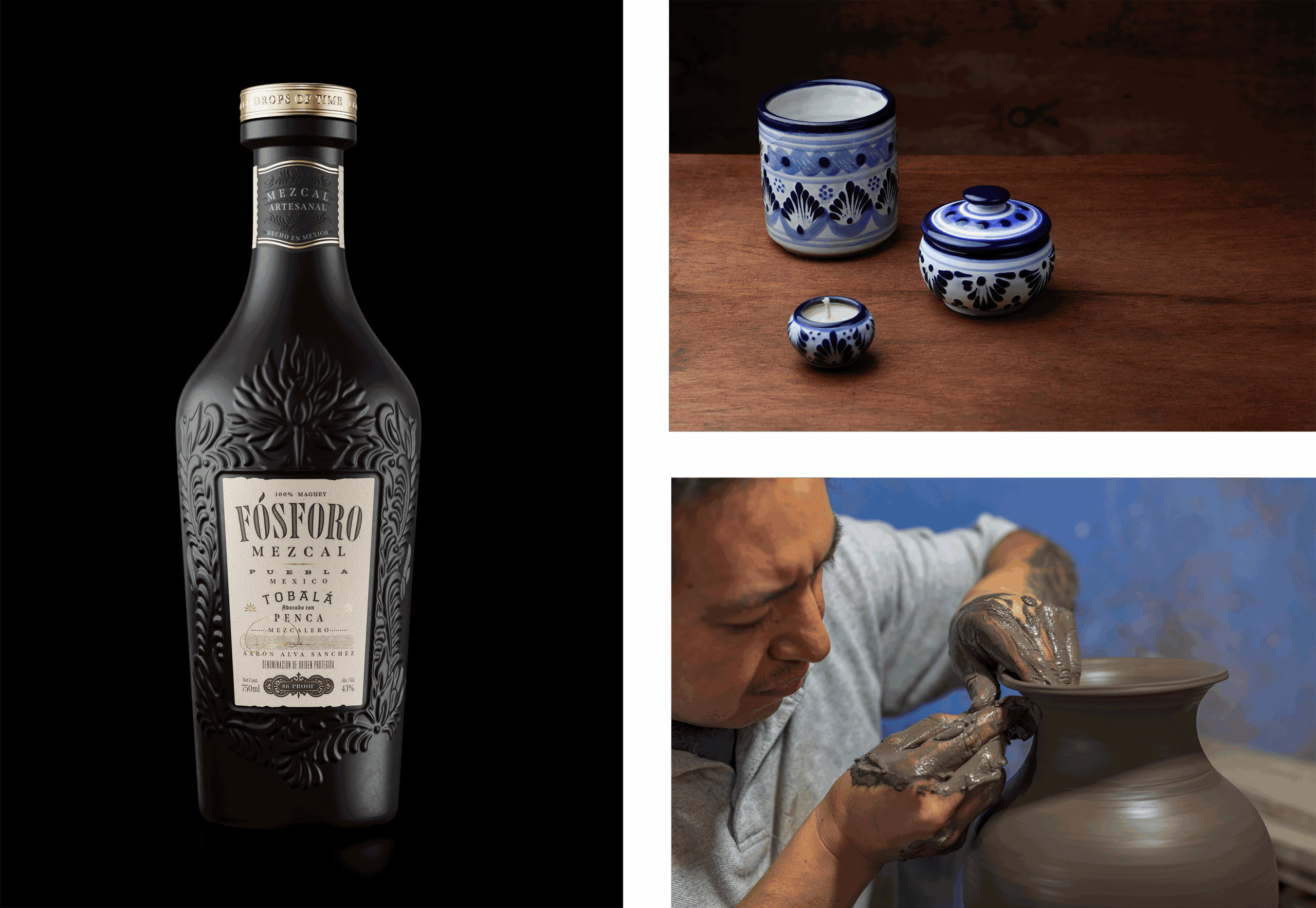
While researching we collected visual inspiration. An early logo and bottle concept, based on traditional Mexican pottery, were supplied by our clients, helping inform our approach. We took a deep dive into the history of Mexican talavera ceramics, discovering more forms to play with.
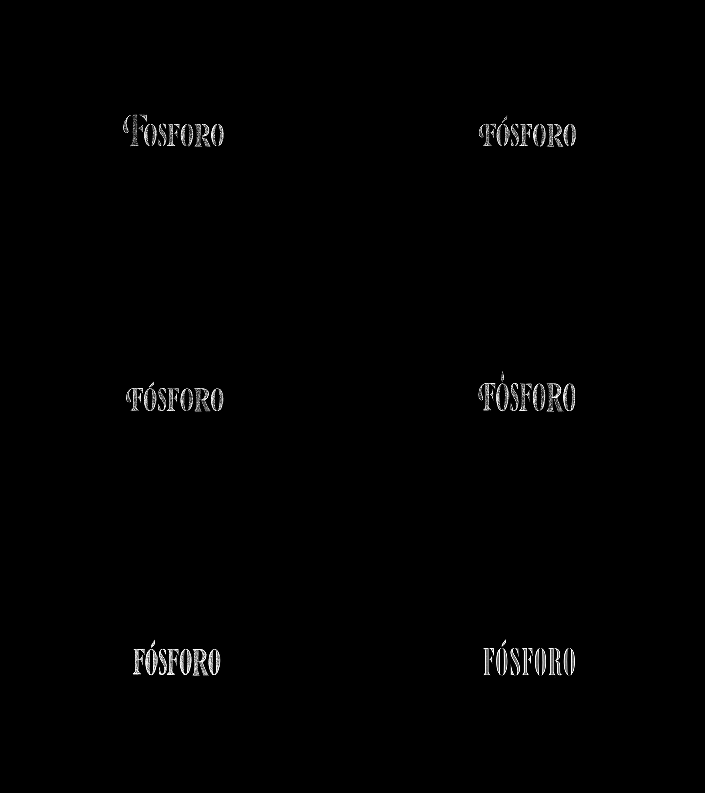
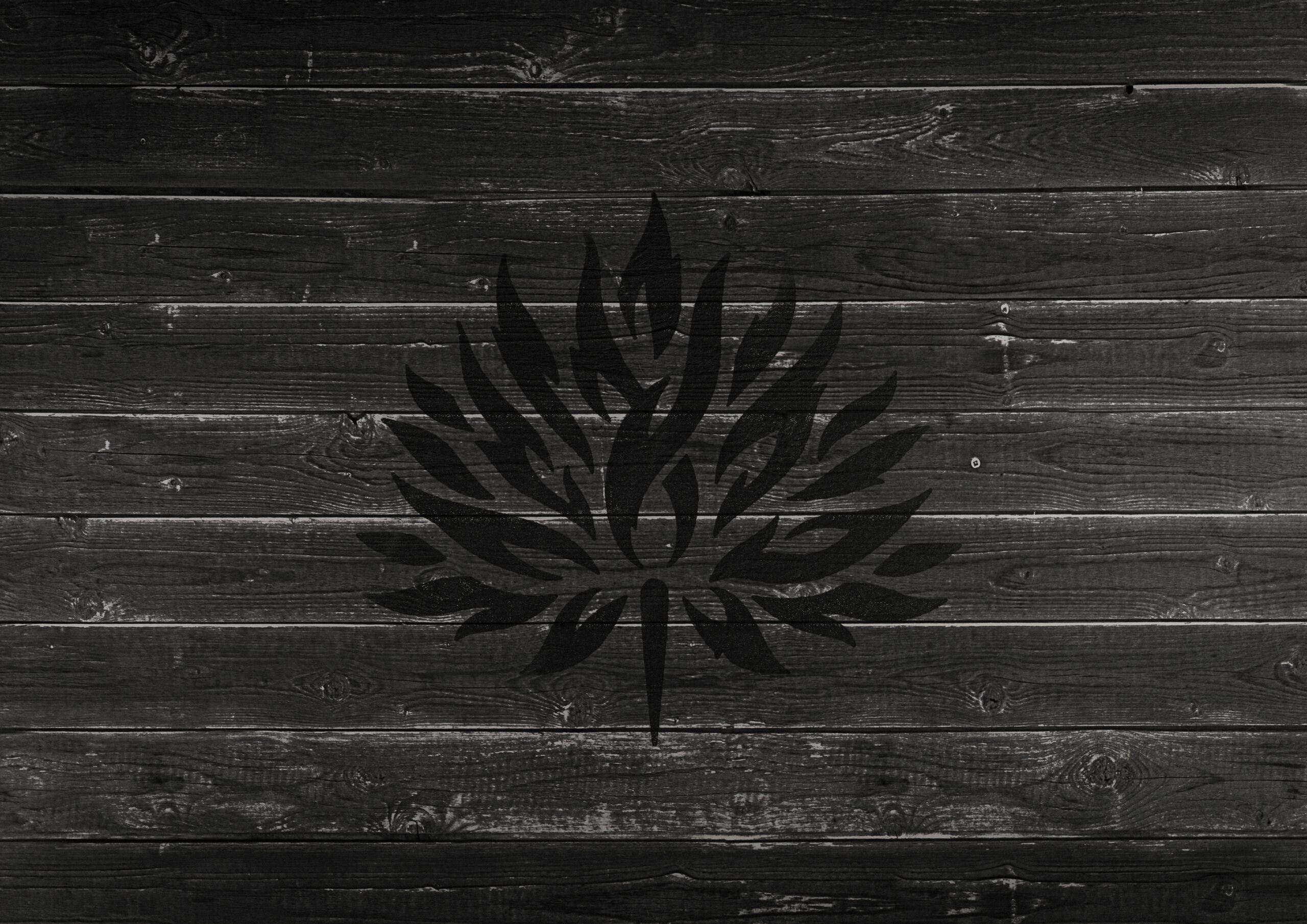
Gradually and iteratively the lettering and graphics were sketched and refined. In the main logotype, a match is hidden in the counter of the first O in Fósforo, with the accent above forming its flame. Our burning maguey graphic accentuates the flame theme and conceals another match. The small maguey graphic used to break up the label copy contains a symbolic drop of the liquid.

Creating a custom bottle
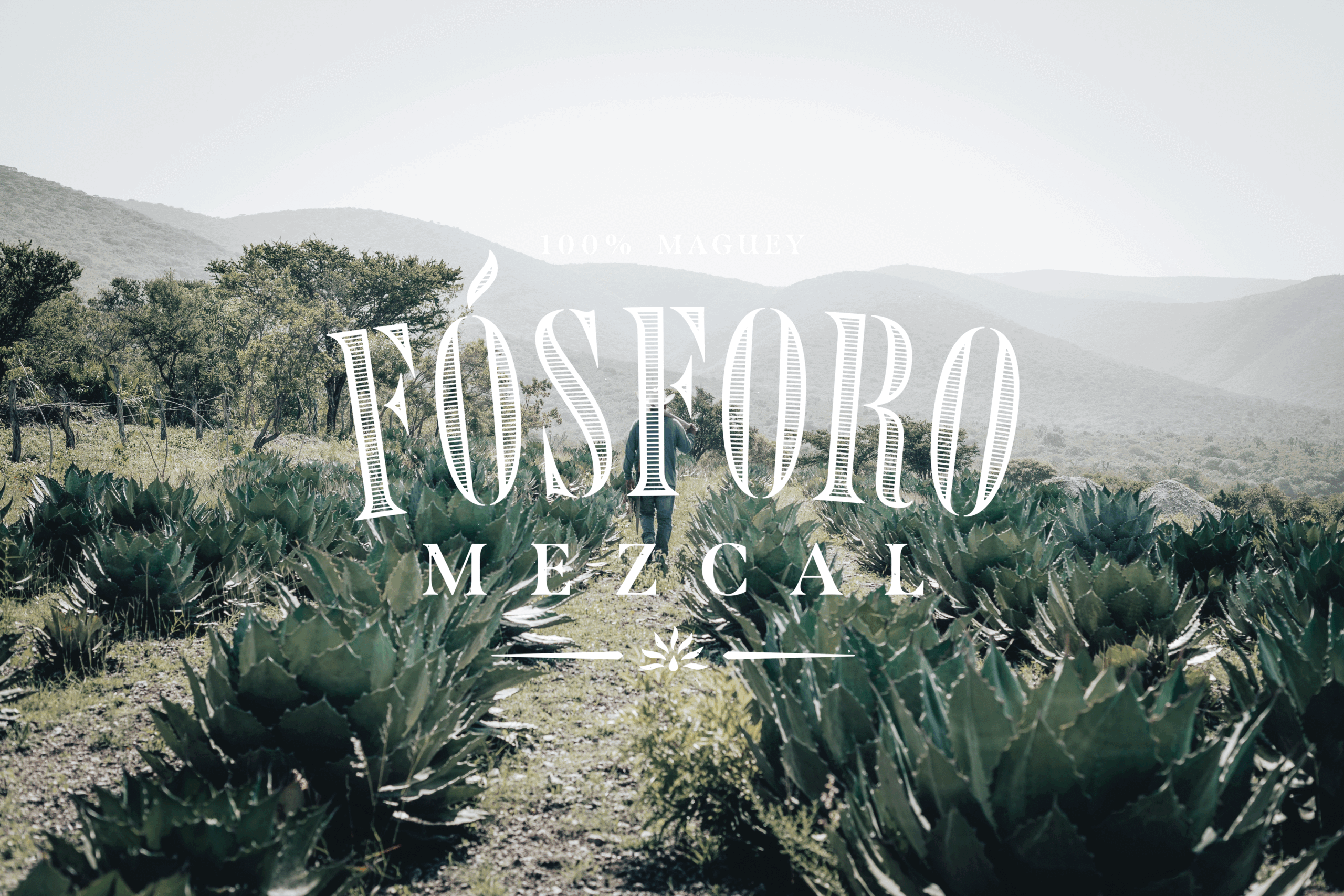
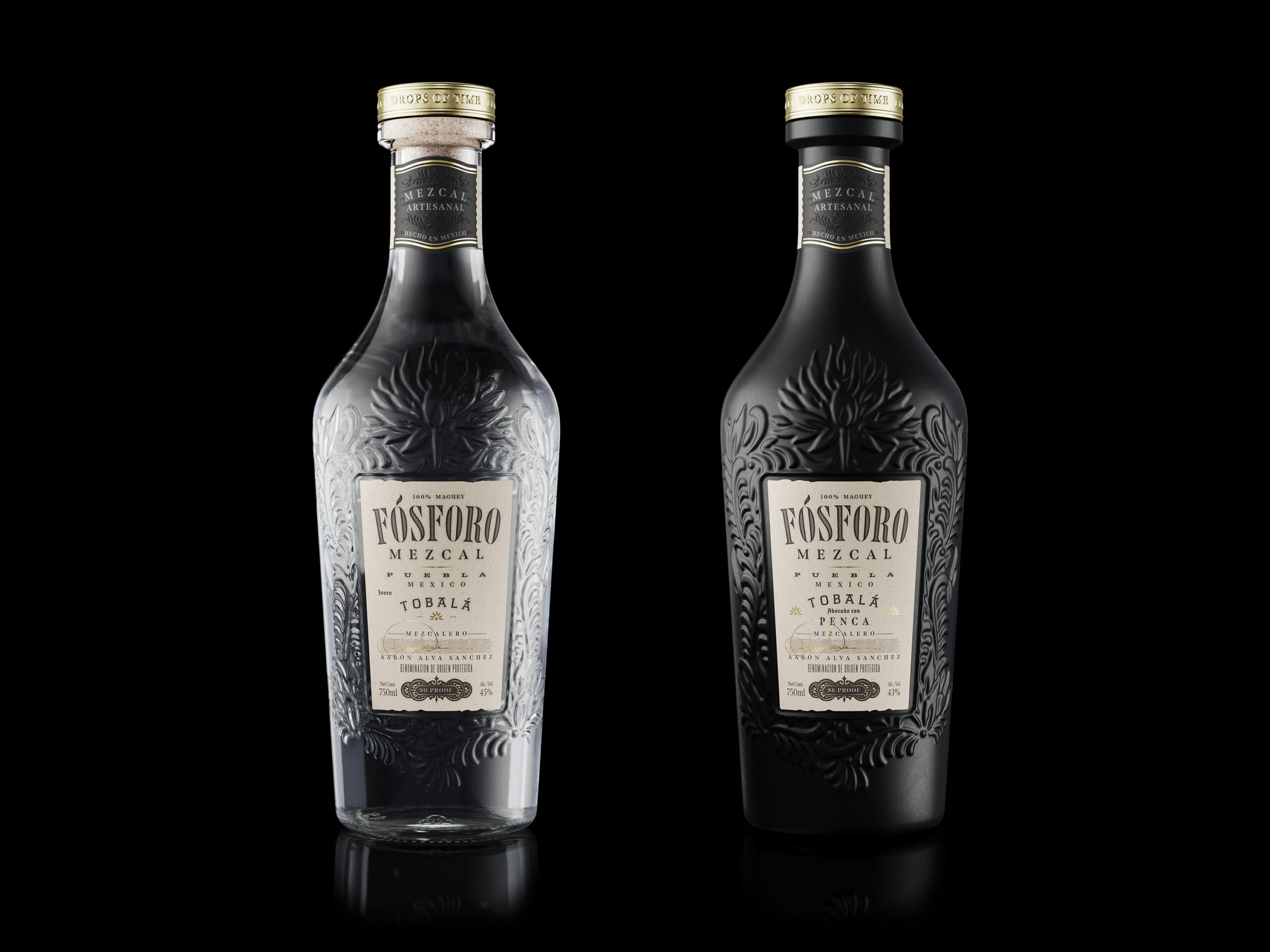
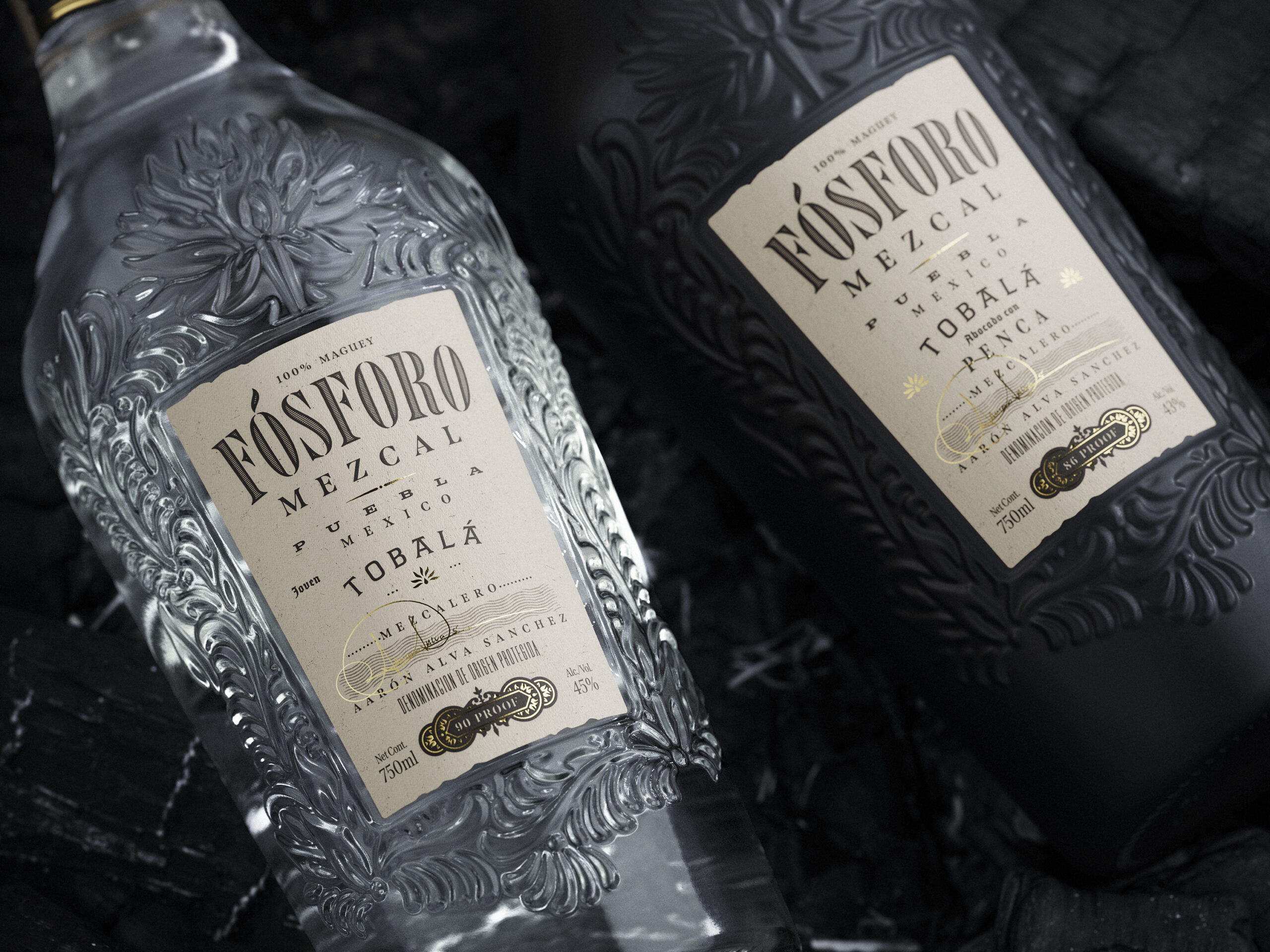
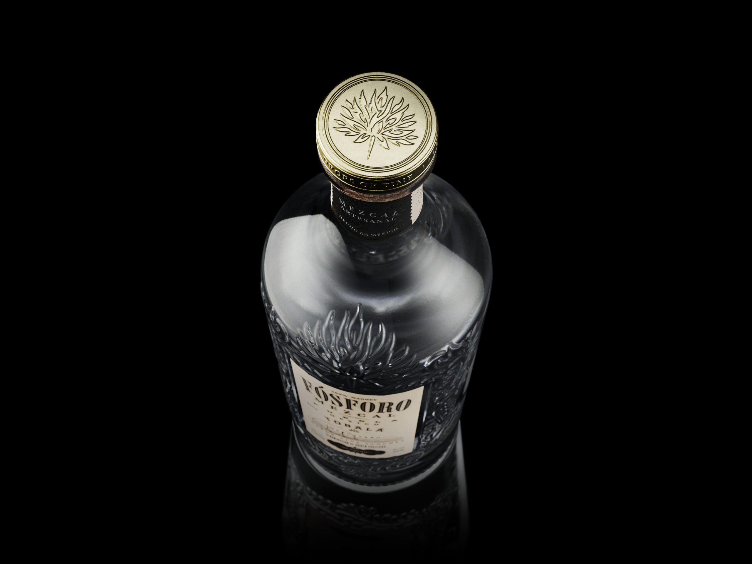
While competitors use everything from plain wine bottle forms through to stout and sturdy bourbon pots, the Fósforo bottle had to look elegant, sophisticated and precious. Our classy and curvaceous bottle has a touch of femininity, adorned with strokes raised on the glass forming maguey plants and flames. Each stroke is reminiscent of our flaming maguey motif, but overall the style was inspired by talavera glazing.
Brand assets
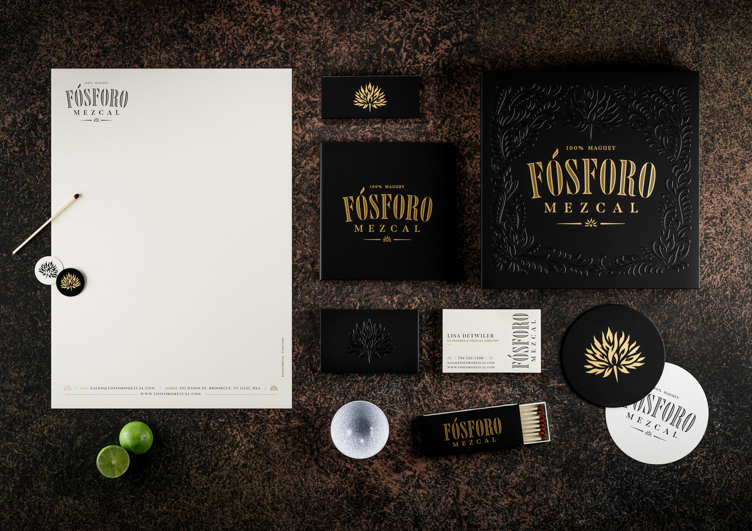
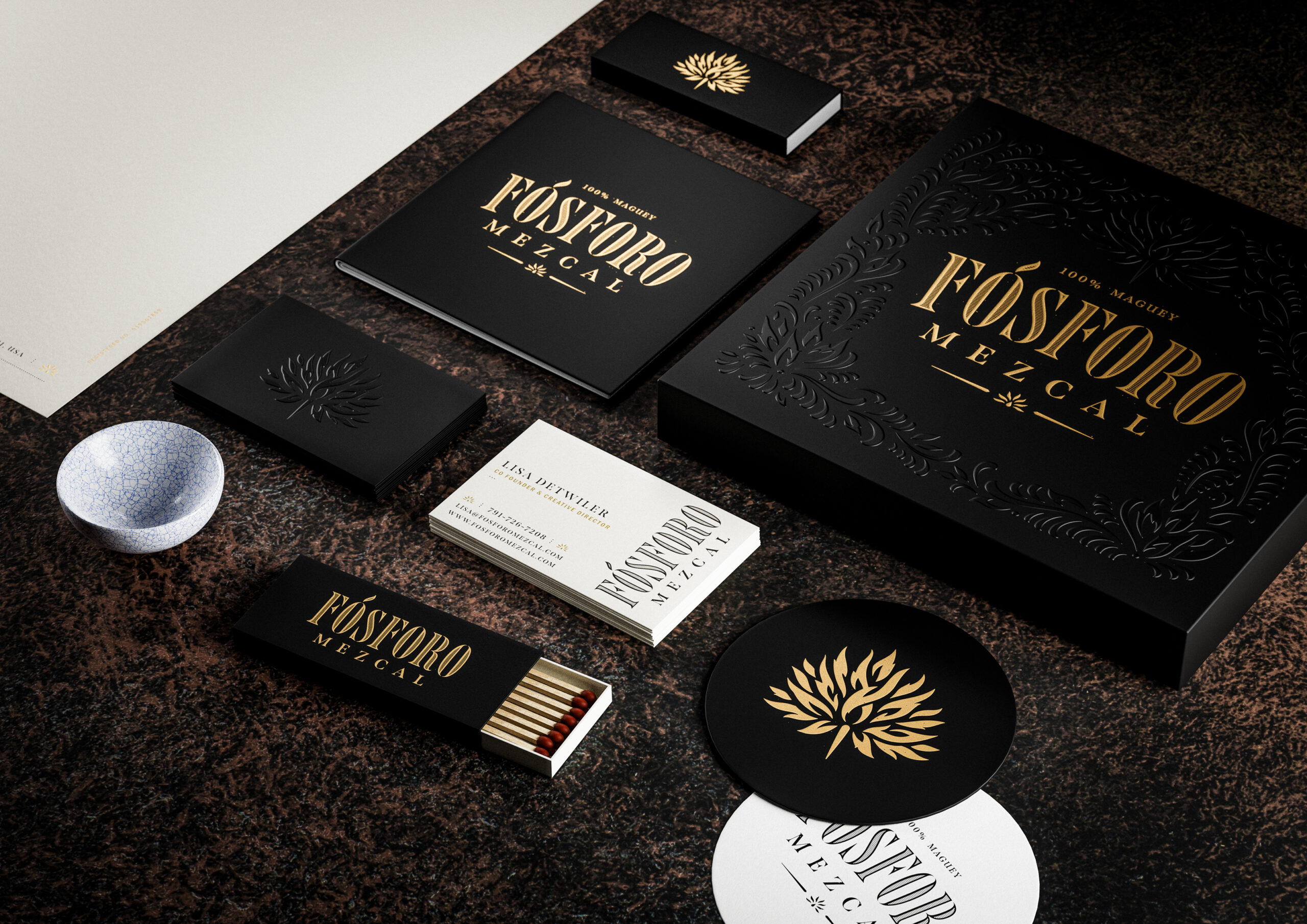
The bottle, label and logotype were supplemented with a suite of graphics and guidelines for implementing the Fósforo brand across sales, marketing and advertising activities.
We defined a colour palette consisting of cream and a neutral ‘black’. Gold foil is used across the neck, front and back labels for the premium touch.
The typefaces specified include Span by Jamie Clarke for headers – a traditional, well-structured serif – and Franklin Gothic Condensed for body copy, which is a sans serif face that is a classic in its own right and is always readable.
Conclusion
With a relatively minimal, typography led label that accentuates Fósforo’s Mexican origins, the artistry of the bottle really steps to the fore. Both the clear Tobalá and the black Tobalá Penca versions of Fósforo look elegant and luxurious. They look like a treat – enticing drinkers to sample mezcal for the first time. The tactile bottle design makes Fósforo a perfect gift item.
Developing this brand, we’ve shown that a spirit need not be defined by the tropes repeated by competitor products. Well-made and beautifully packaged, Fósforo mezcal can sit on the premium shelf alongside the finest Scotch or brandy.
Credits
Creative direction & design by Ginger Monkey, Tom Lane
Copy & research by Garrick Webster
Bottle & label visualistions by Boo BY
Industrial design and CAD support by Aileron Design