Edinburgh Mercantile
-
Branding
-
Creative Direction
-
Illustration
-
Lettering
-
Strategy
When Edinburgh Mercantile got in touch about establishing an online and bricks‑and‑mortar business, it offered a chance to apply the studio’s identity‑driven approach to retail. From the outset there was a natural alignment with founders David and Roz Spencer, which set a clear direction. They already had a strong sense of what they wanted the business to champion, but needed a brand narrative that would give it meaning and traction with prospective customers.
The first thing we did was to ask them about the aims and objectives of their business, who their customers were, the space in the market they wanted to occupy and their values. Their response was articulate, rich in ideas and very clear on Edinburgh Mercantile’s mission.
Our clients told us about their location in Stockdale, part of Edinburgh’s New Town. They talked about being a modern lifestyle brand, influenced by the traditional general store and with the aim of becoming a go-to curiosity shop. But we needed to identify some themes, ideas and stories to anchor the brand in its community and inform an ownable look and feel. A wide range of research into the neighbourhood, the city, its environs and history was undertaken, with an eye out for anything that resonated with David and Roz’s ideas. We also looked at how the concept of the general store had developed historically, and its role in the community.
Because our client had such clear ideas about what their brand meant, it was important that our lines of research remained true to their mission. The aim was to augment their thinking rather than finding tangents or alternatives to challenge the agenda.
Developing the logotype
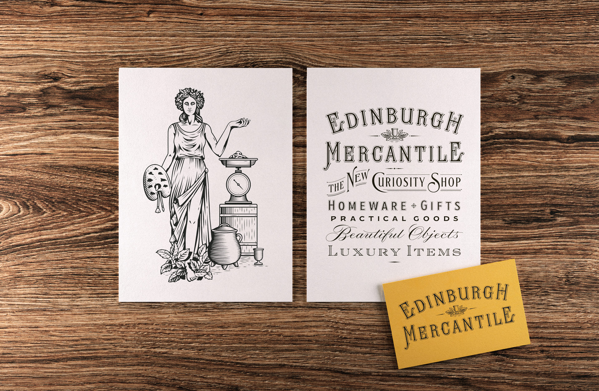
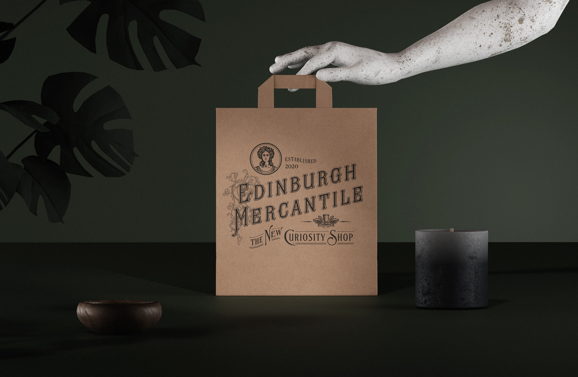
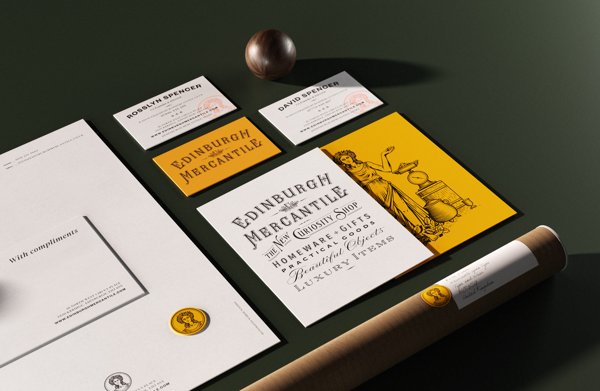
The logotype developed for the brand was drawn using influences from old general store signs, as well as the masthead from Chambers’s Edinburgh Journal. Our clients loved one particular quotation we unearthed, by Jeremy Bentham, the founder of Utilitarianism:
“Utilitarianism is that property in any object, whereby it tends to produce benefit, advantage, pleasure, good or happiness…”
The right supporting imagery
To provide the brand with visual cues it could own, we developed a range of supporting elements and imagery. David and Roz wanted Edinburgh Mercantile to have deep British roots. Our research had shown that it was common for 19thcentury journals to call on a classical character to embody their ideals – so we decided to seek one out for EM.
A second round of research ensued, and we discovered Branwen, the Celtic goddess of love and beauty from the Welsh stories of the Mabinogion. A linework illustration was drawn for her, surrounded by elements that would support the brand – salt, representing value; scales, as per a 19thcentury general store; a cauldron and cup, which are Branwen’s symbols and tie in with homeware; a painter’s palette to represent creativity; and some alder leaves, which are part of Branwen’s story and symbolise health and wellbeing.
The finished identity
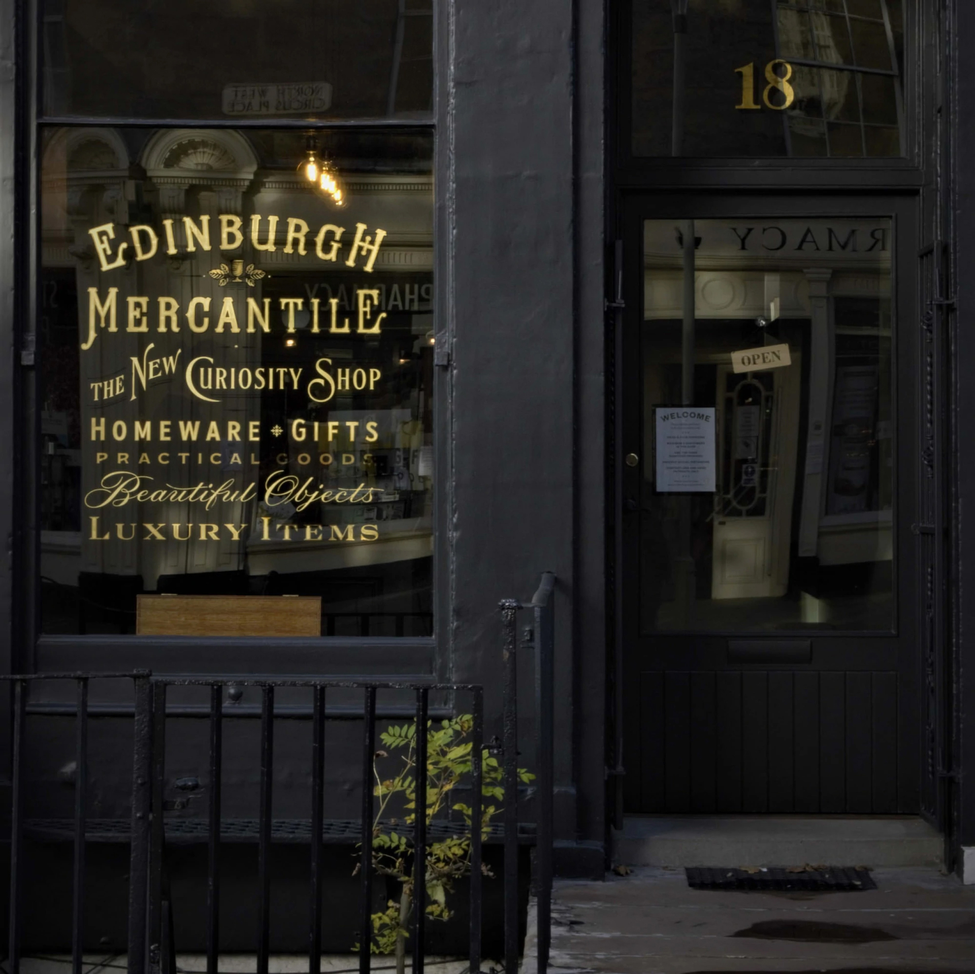
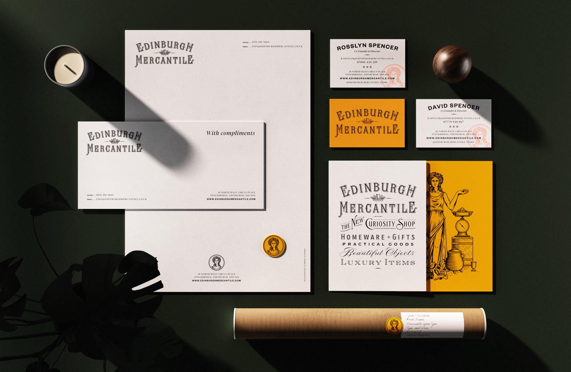
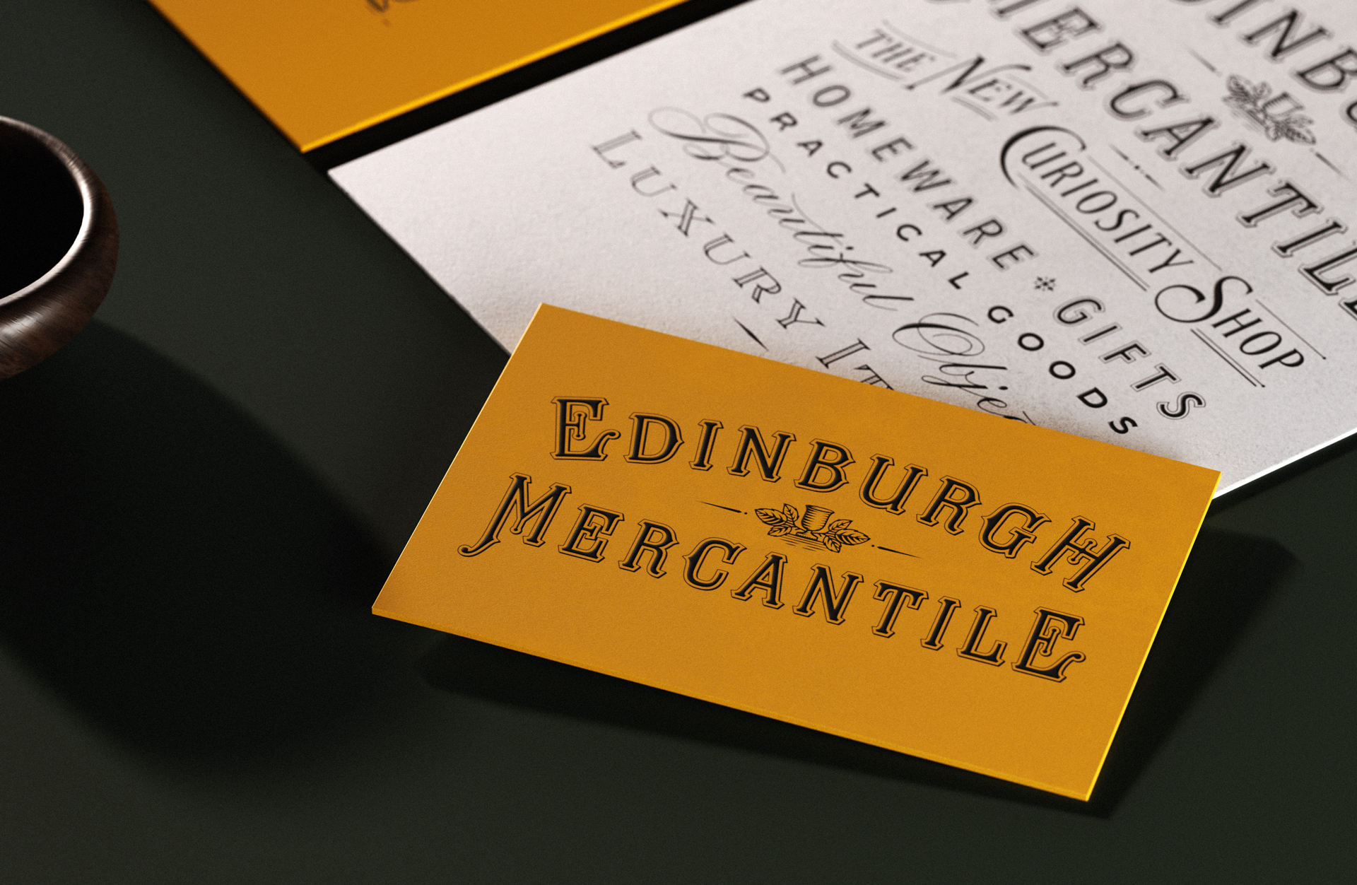
Taking so much inspiration from that original idea of the general store, it would have been easy to come up with a clichéd ‘olde worlde’ style brand. Rather than that, we’ve managed to keep the look and feel of the brand classy and restrained. While the signwriting style of the 19thcentury is there, beautifully reproduced in gold foil on the front window at 18 North West Circus Place in Stockbridge, Edinburgh, it doesn’t hit you over the head with heritage. Online and instore, the well-designed, desirable stock is able to speak for itself, supported by a memorable brand that communicates the vision of the owners, David and Roz Spencer.