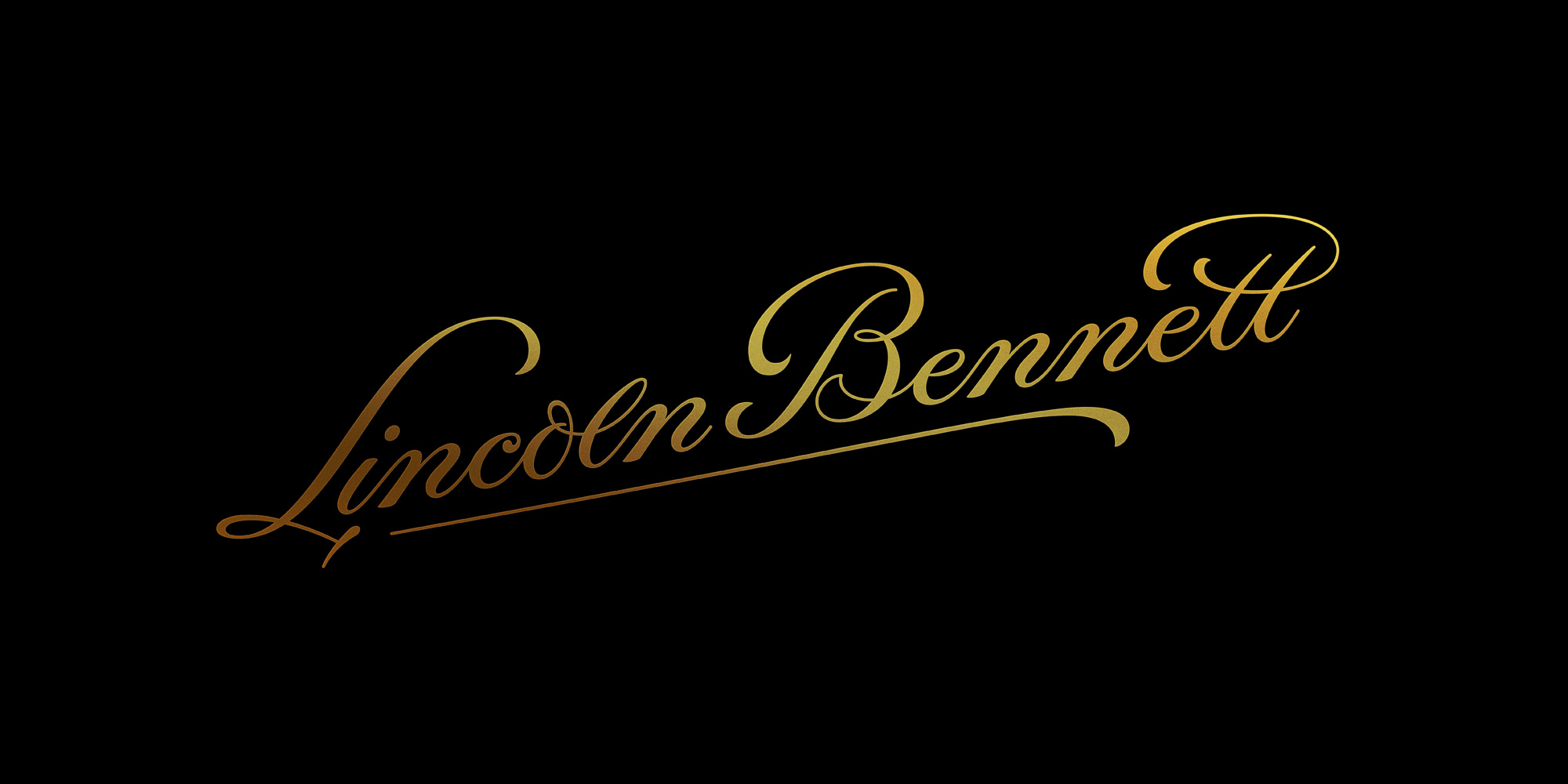
Lincoln Bennett & Co.
CASE STUDY
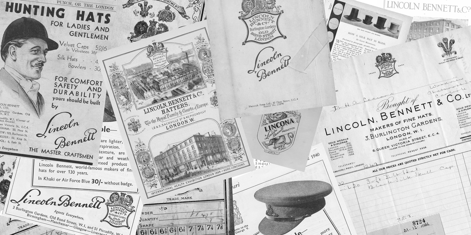
Not many people outside the world of hat making will know the name Lincoln Bennett & Co, but the company was a leading maker of gentleman’s headwear in the 19th and early 20th centuries. The firm was sold off in the aftermath of WWII at a time when wearing hats were diminishing as a societal convention, and hats were no longer produced in the brand’s name after the 1980s. In 2015, Lincoln Bennett & Co’s intellectual property was acquired by United Heritage Limited, which incubates and re-launches dormant British luxury consumer brands. United Heritage director Robert Black approached me with a very specific challenge: preserve the heritage of the Lincoln Bennett brand in a way that can be applied in a modern context.
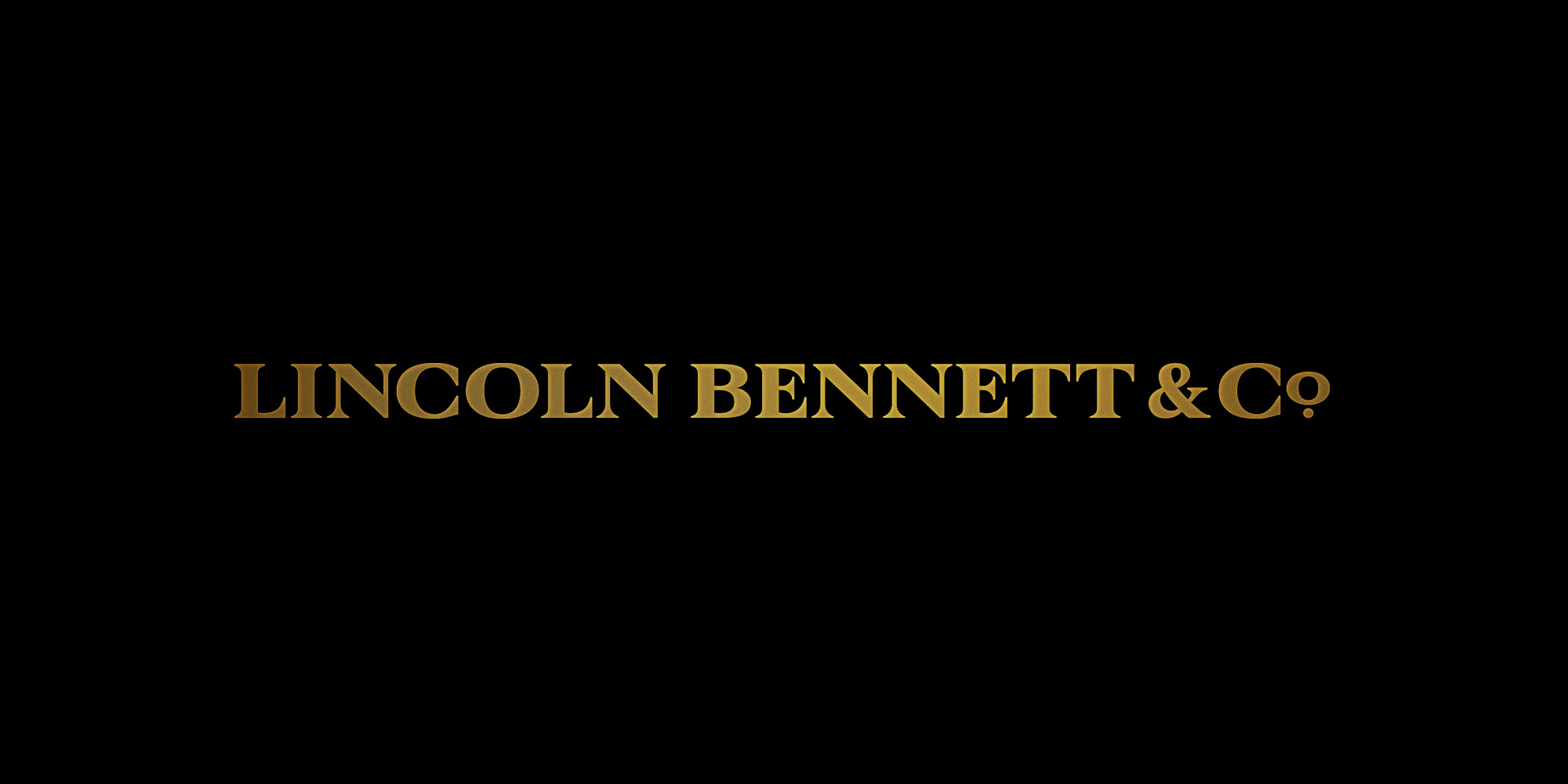
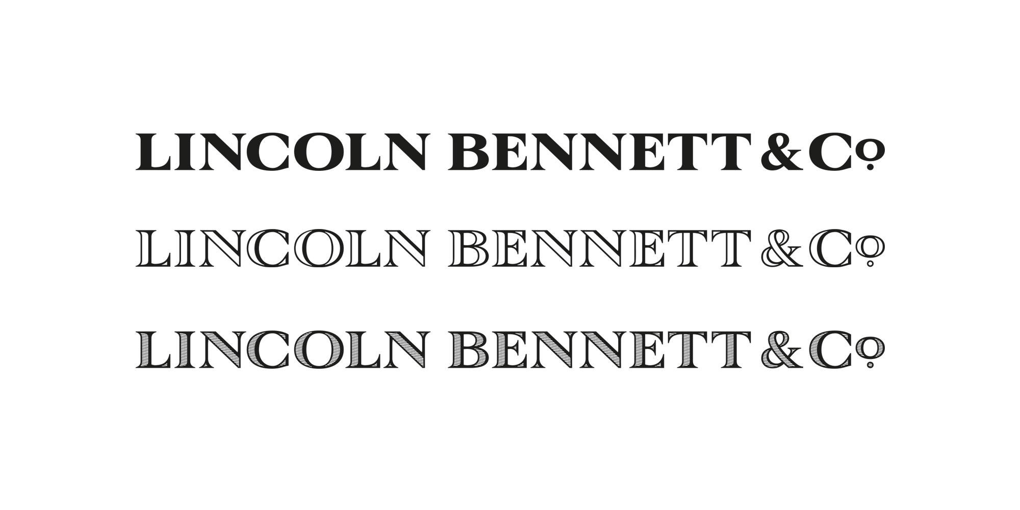
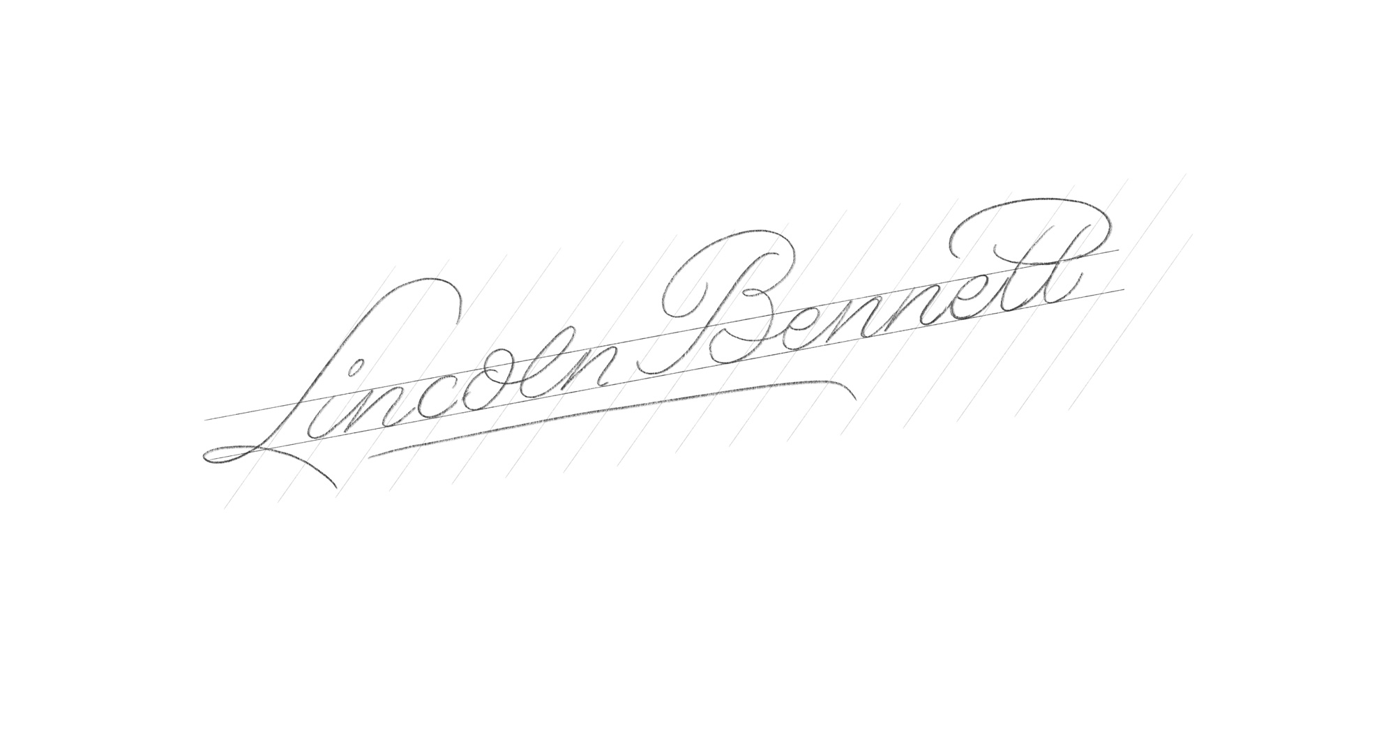
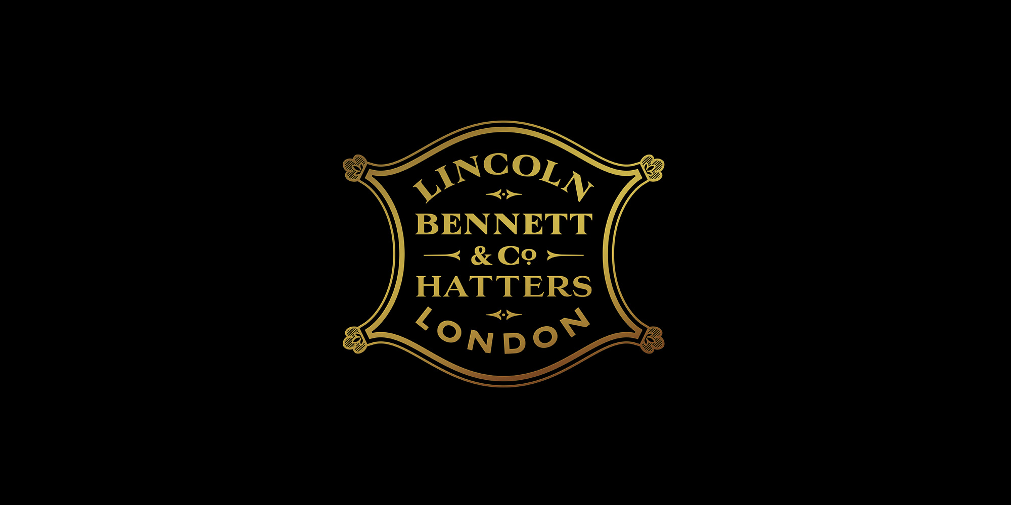
Although my client had all the logos he might have needed within the Lincoln Bennett & Co archive that he’d gathered, the visual identity needed a stronger thread of consistency, particularly across three main assets: a primary logotype; a secondary script logotype; and a neat and tidy lock-up to go inside each hat. The primary logotype uses bespoke serif lettering reflecting the period the company originally operated in. To add accent for certain applications, outline and shaded versions were also drawn.
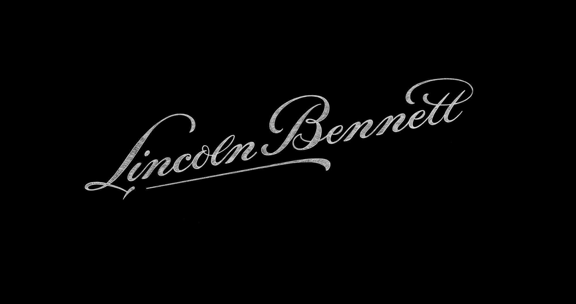
The tension between old-fashioned charm and modern branding requirements came to the fore when developing the script-based logotype. Early Lincoln Bennett & Co advertising had the company’s name rendered calligraphically, with slightly different iterations in each specimen. The flourish on the L sometimes reached as far as the B, and in several cases the Ts were crossed right at the top of their ascenders. The trick here was getting the angle just right, and retaining the character of freehand script while bringing balance and rhythm to the proportion, spacing and embellishment.
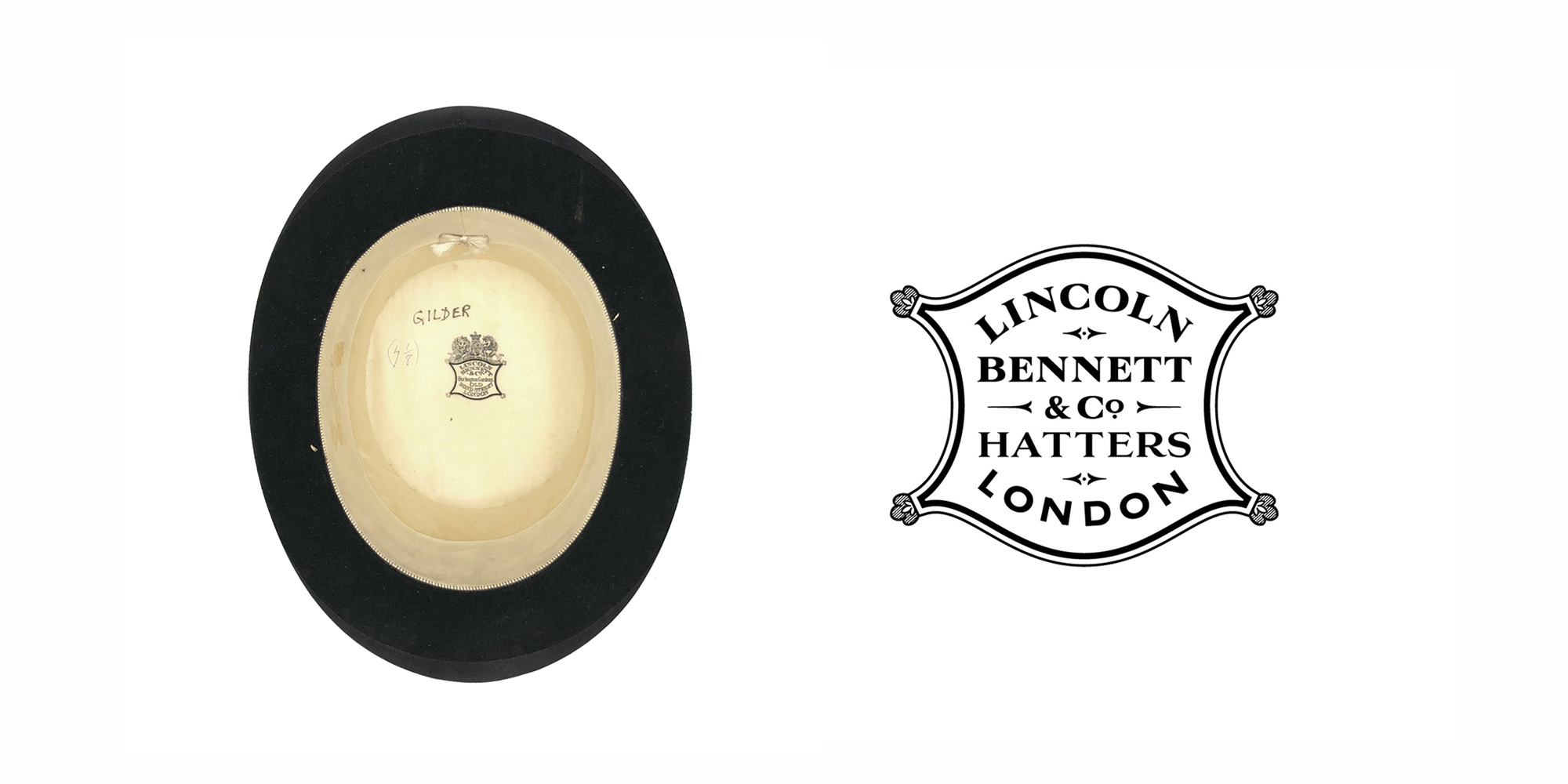
Old Lincoln Bennett & Co hats contained an emblem displaying the royal crest, along with an unusual shape that alludes to a vintage pincushion. Removing the lion, unicorn and shield, the pincushion element has been simplified for the brand’s reintroduction by elegantly reflecting the company’s heritage. All the design and manufacturing is being done in the UK – an important aspect of the brand’s worldwide cachet, particularly in markets like the US and Japan where its quality and provenance will appeal to premium customers.
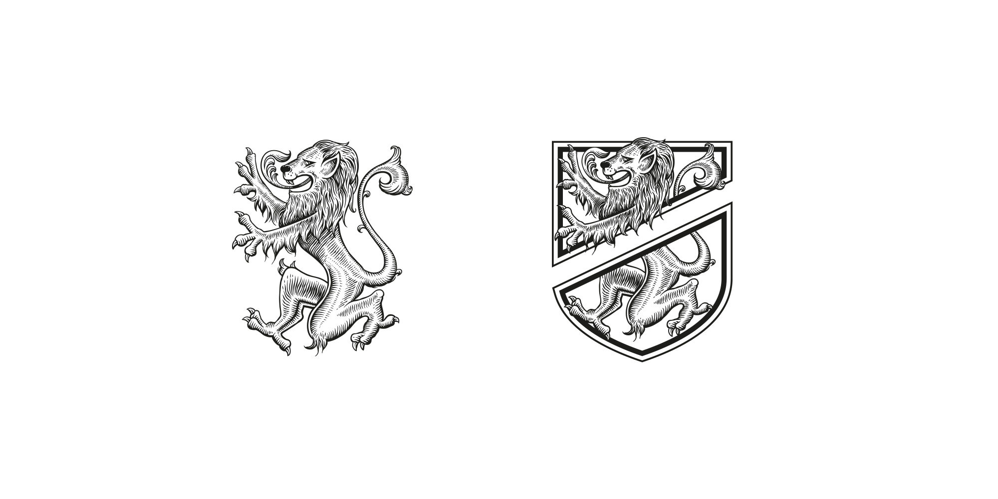
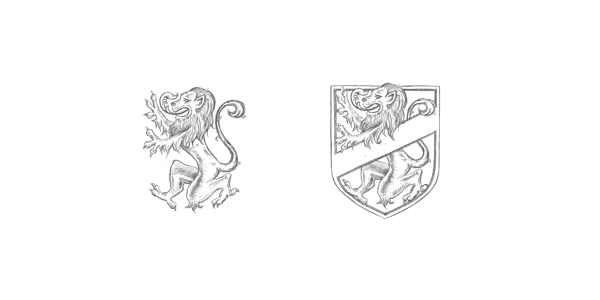
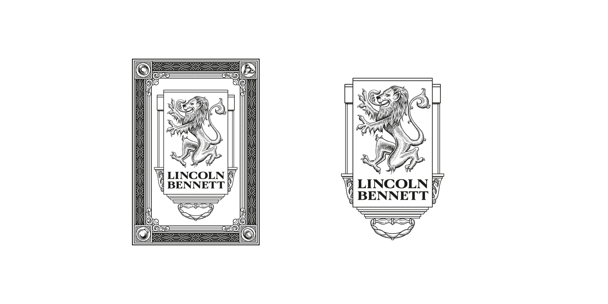
Lincoln Bennett & Co’s hats were of such quality that the firm became a royal supplier. While the royal warrant has long since lapsed, we wanted to maintain an aspect of that heritage within the new visual identity. Amongst the reference material was an illustration of a lion on a shield relating to an old Lincoln Bennett & Co hat called The Lincona. Focussing on this piece of historical brand collateral, I redrew the crest to resemble a woodblock print, varying the weights in the line work to convey light, shadow, depth and tone.
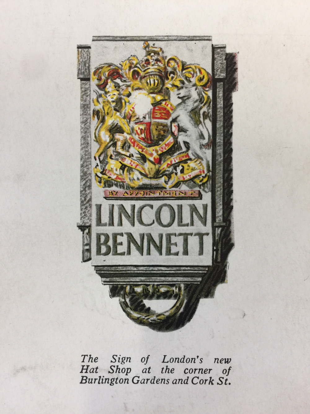
One archival document contained a report on the opening of Lincoln Bennett & Co’s shop on Burlington Gardens in 1929, alongside a depiction of the new exterior shop sign. This became the inspiration for the swing ticket that will accompany each individual hat. With an embellished border that features a vintage hat design on each corner, the ticket was another opportunity to use the woodblock-style crest displaying the lion rampant.
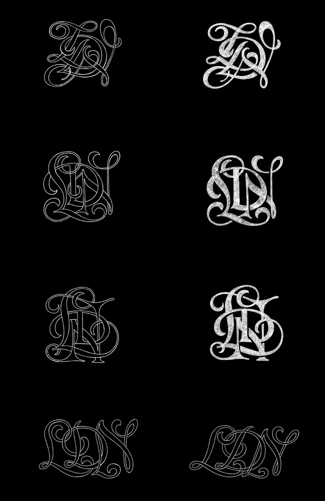
While developing adornment concepts for the hats, my client identified the need for a small visual device that could be stamped onto a piece of leather or embroidered onto the hats themselves. I began creating an elegant LDN cypher, following in the Georgian style, as a representation of the city of London. To reduce complexity and aid recognition, Robert suggested keeping the lettering to one level, while still locking the letters together using exaggerated arcs and flourishes. It’s a perfect example of collaboration leading to a stronger design solution.
As we ready for the 2019 re-launch of Lincoln Bennett & Co, the updated collateral that Tom produced has been invaluable in helping set the visual tone for the brand across different media. Tom was a pleasure to work with due to his collaborative approach and thoughtful communication around the project, so much so that we continue to work with him on a number of other brands in our pipeline.”
–Robert Black, United Heritage Limited
