Brisbane Distillery Company
CASE STUDY
While craft spirits are all the rage in Europe and North America, the phenomenon is new on the Australian drinks market. For example, while there are over 50 craft breweries in the Brisbane area, until recently there hasn’t been an independent distillery there since the 1920s. Jon Atherton, founder of Brisbane Distillery Company, has set out to change all that with a specialist distillery rooted in the city and producing an extensive range of rums, gins and vodkas.
Early in 2019, Jon got in touch with a mouth-watering challenge: to develop a complete brand identity system for his new venture, encompassing a logo toolkit, bottle and label designs, brand book, stationery and collateral to support the gin school he is launching on the premises.
In-depth research
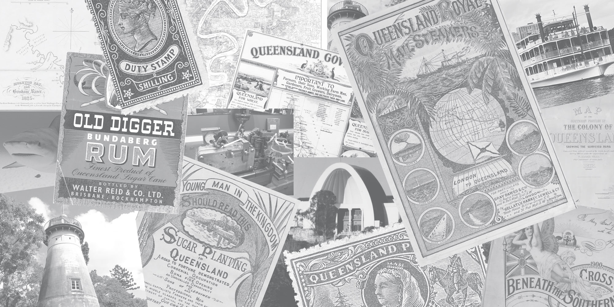
A solid brand only comes about through understanding your client, the market and the products they’re introducing. This began organically through conversations with Jon, who took me through the proposition. He wanted to introduce a range of premium liquors made using a ‘grain to glass’ craft method, each specially flavoured and aimed at Queenslanders aged 40 to 60 – late professionals with a bit of money to spend. It was important to John that the brand was rooted in Brisbane and the state of Queensland, but also that it would appeal to the export market. He wanted something more sophisticated than the common Australian narrative, which harks back to convicts, shipwrecks and the rough-and-ready frontier heritage. The first thing we needed to do was to delve into Brisbane’s fascinating history.
Developing the concept
While building up a bank of reference imagery from Brisbane’s past, I briefed copywriter Garrick Webster to identify some key themes that might help us develop a brand for Jon. Our research covered the history of Brisbane and Queensland, its geography, trade, industry, agriculture, society and culture. The city has a down-to-earth vibe and used to be a place people came to make a quick buck. While we took that ‘Bris-vegas’ image into account we needed something much more refined for this brand.
Two main routes emerged. One was based on the Brisbane river. A focal point of the city, it’s a haven for wildlife, greenery and relaxation for Brisbanites. As a water source, it could tie in well with the distillery’s narrative and its bends, tributaries, flora and fauna might have provided some great product names. Black Snake Vodka, Toowong Gin and Bull Shark Rum would have been superb.
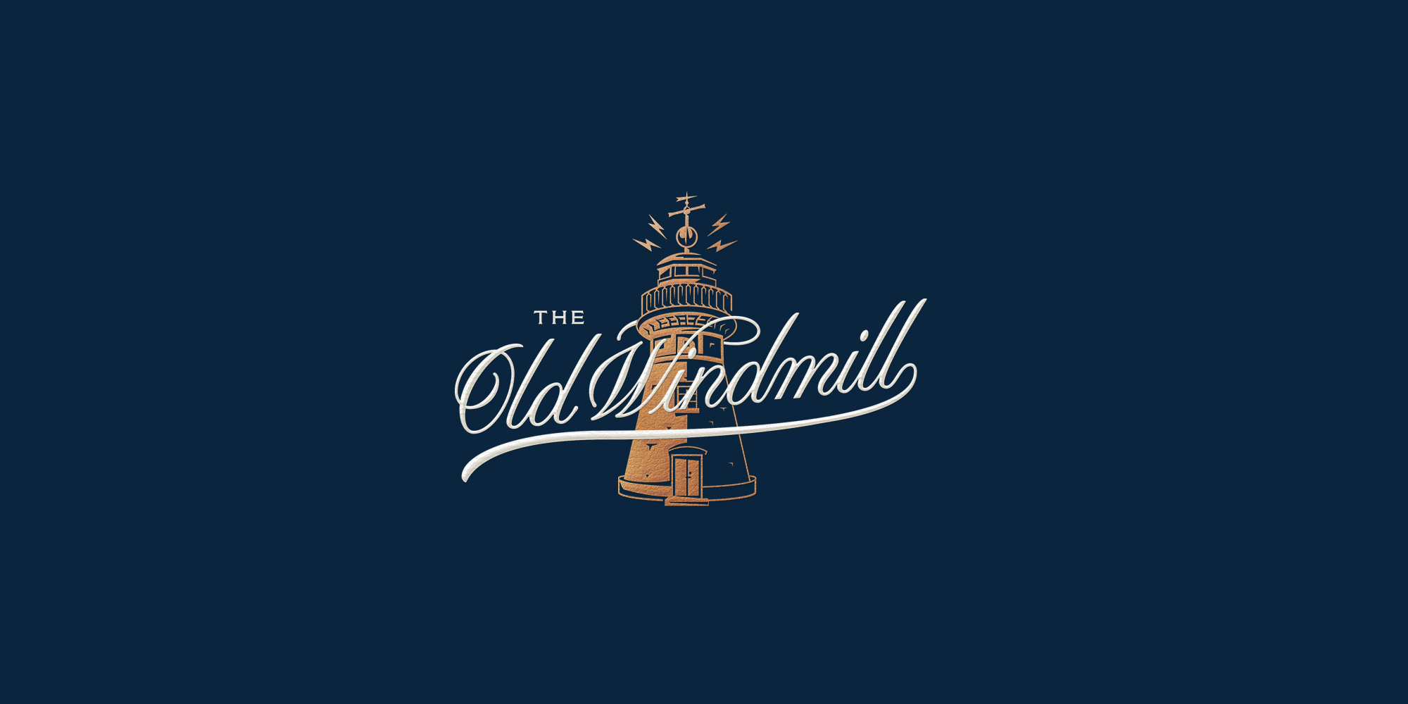
However, our ‘eureka’ moment emerged from the city’s history. Brisbane’s oldest landmark is the Old Windmill. Dating back to the 1820s, it was built by convicts, used to grind grain for the settlers, and after its sweeps were removed it became a communications tower. The mill had a time ball on top, which was lowered at 1pm daily. Navigators on the river and in the port could set their instruments by it, and it gave everyone else a rough idea of the time. The mill housed Brisbane’s telegraph office, and in the 20th century became a radio and television transmitter. It’s a perfect icon for a brand rooted in the city but connected to the rest of Australia and the outside world.
The bottling challenge
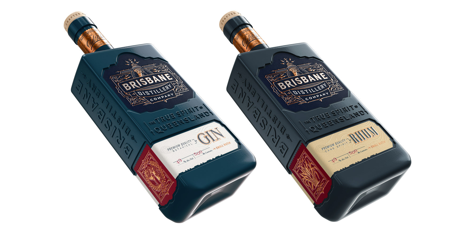
Perhaps the biggest problem within the brief involved the product range itself. To capitalise on the growing gin market, Jon was developing a whole range of botanical recipes and had plans for various tea-flavoured vodkas. While it would have been fun to design dozens of individual bottles to emphasise the exotic and nuanced tastes Brisbane Distillery Company was introducing, it wouldn’t have been cost effective. However, nor did I want to use standard bottles with bespoke label designs to differentiate the products. Working closely with the client and bottle producers, I came up with a solution I haven’t seen used elsewhere.
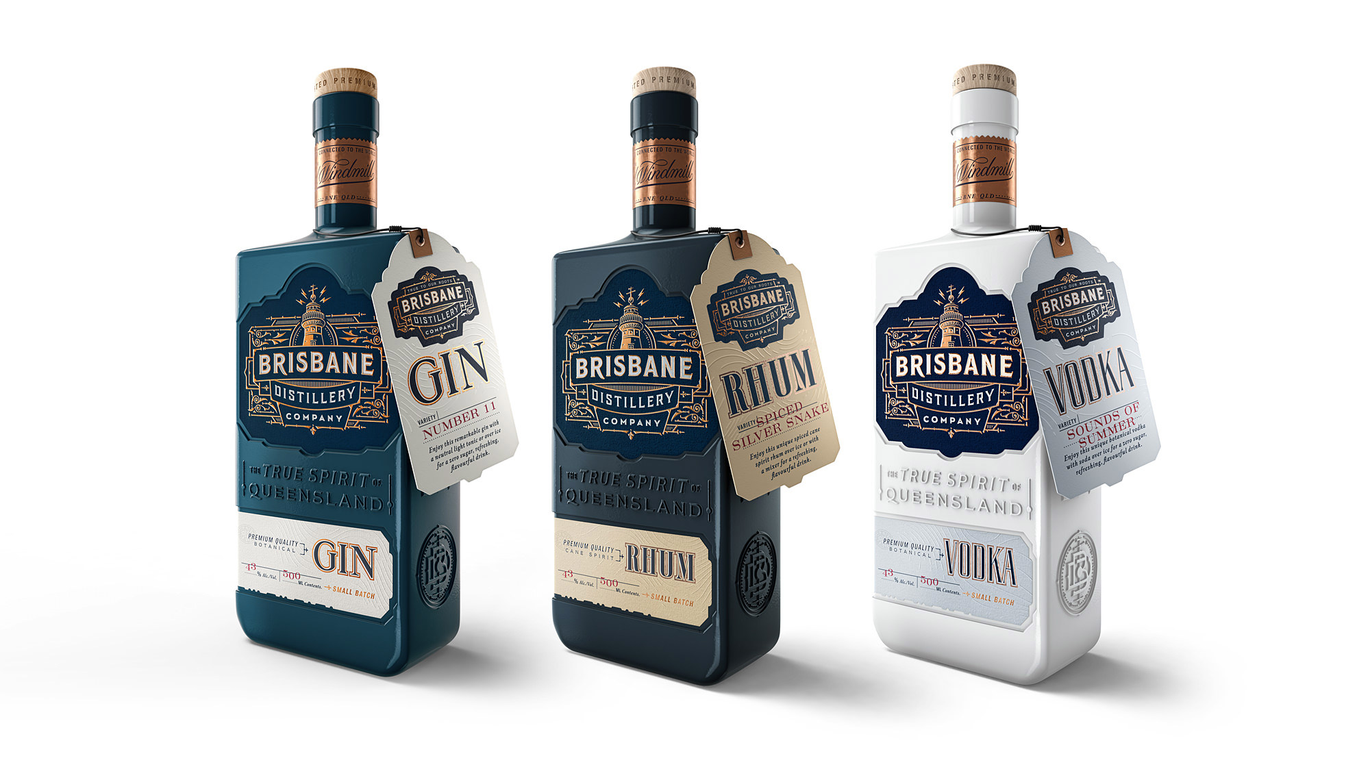
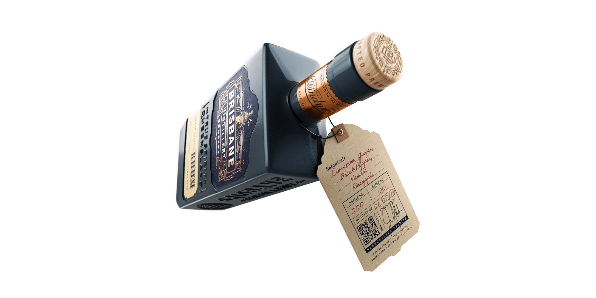
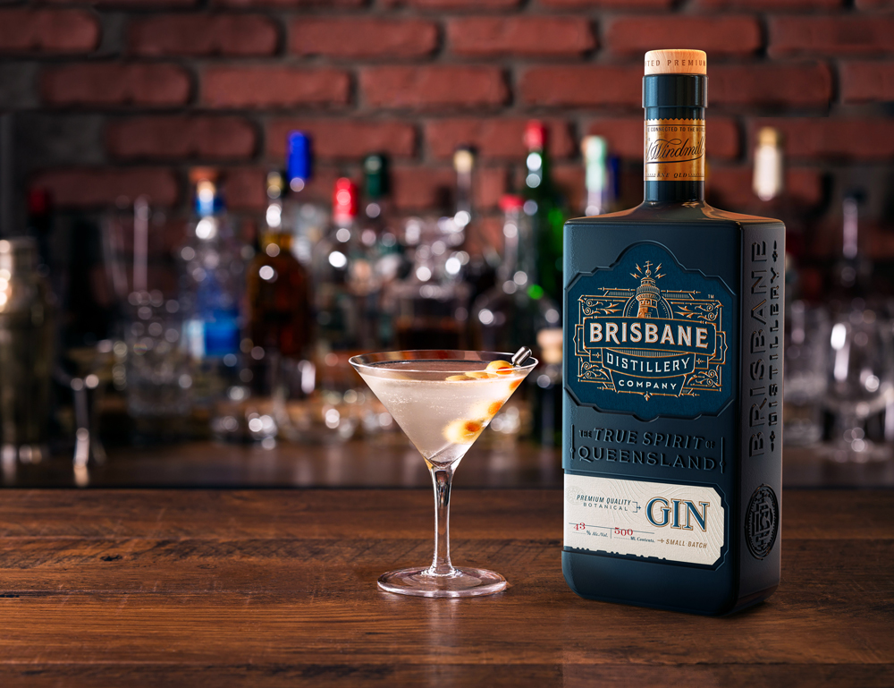
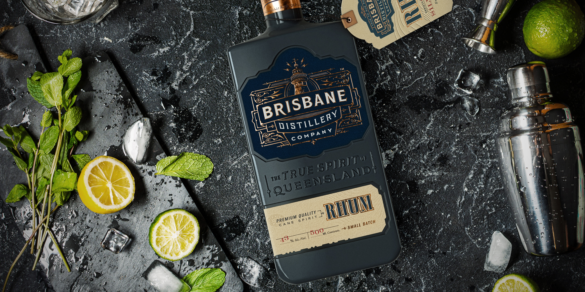
A custom bottle shape is standard across the range, with a relief for a printed label displaying the BDC hero logo to sit in. The strapline ‘The true spirit of Queensland’ stands proud of the bottle surface, and below that is space for a label indicating the spirit inside – rum, vodka or gin. Neck tags are used to specify the exact flavour variety.
What makes this solution even more beautiful is the use coloured glass to differentiate the spirits. Rum will be in dark blue bottles, gin in dark teal, vodka has white bottles and special liqueurs will come in translucent frosted glass.
Furthermore, the bottles are reusable. Bars and individual customers in Brisbane can take them back to the distillery to be refilled. Put it all together and we have a distinctive, flexible, cost-effective and sustainable solution.
From ideas to designs
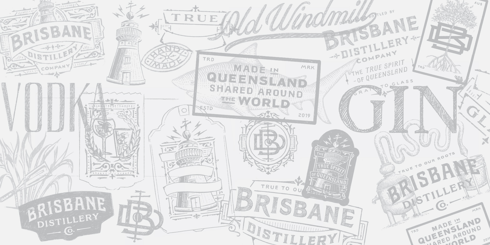
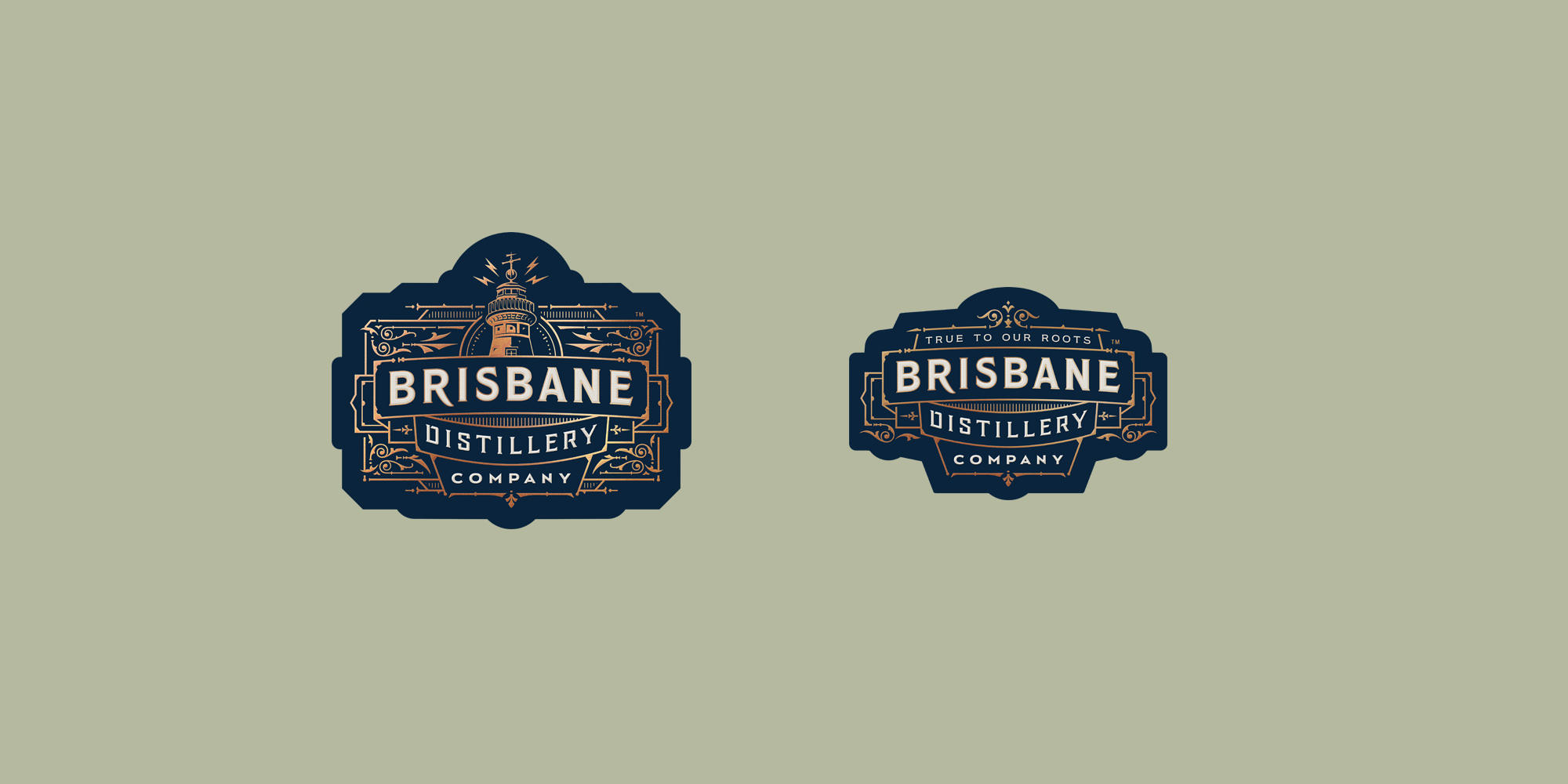
Working from our key themes, the image of the Old Windmill and a set of straplines by the copywriter, I developed a toolkit of core graphics catering to a wide range of applications. The main, all-guns-blazing logo is an elaborate one with the windmill strong and central. The time ball and weathervane are there, and become motifs in some of the secondary logos, lockups and monograms. Sparks above the windmill give it a sense of dynamism and hint at Brisbane’s connection to the rest of the world.
I planned the logos with gold metallic foil in mind, and rather than being an embellishment this element has a structural function. The intricacies and finesse in then foiled lines hint at the craft that goes into BDC’s distilling process, the complexity of the flavours being produced and the premium quality of the liquors.
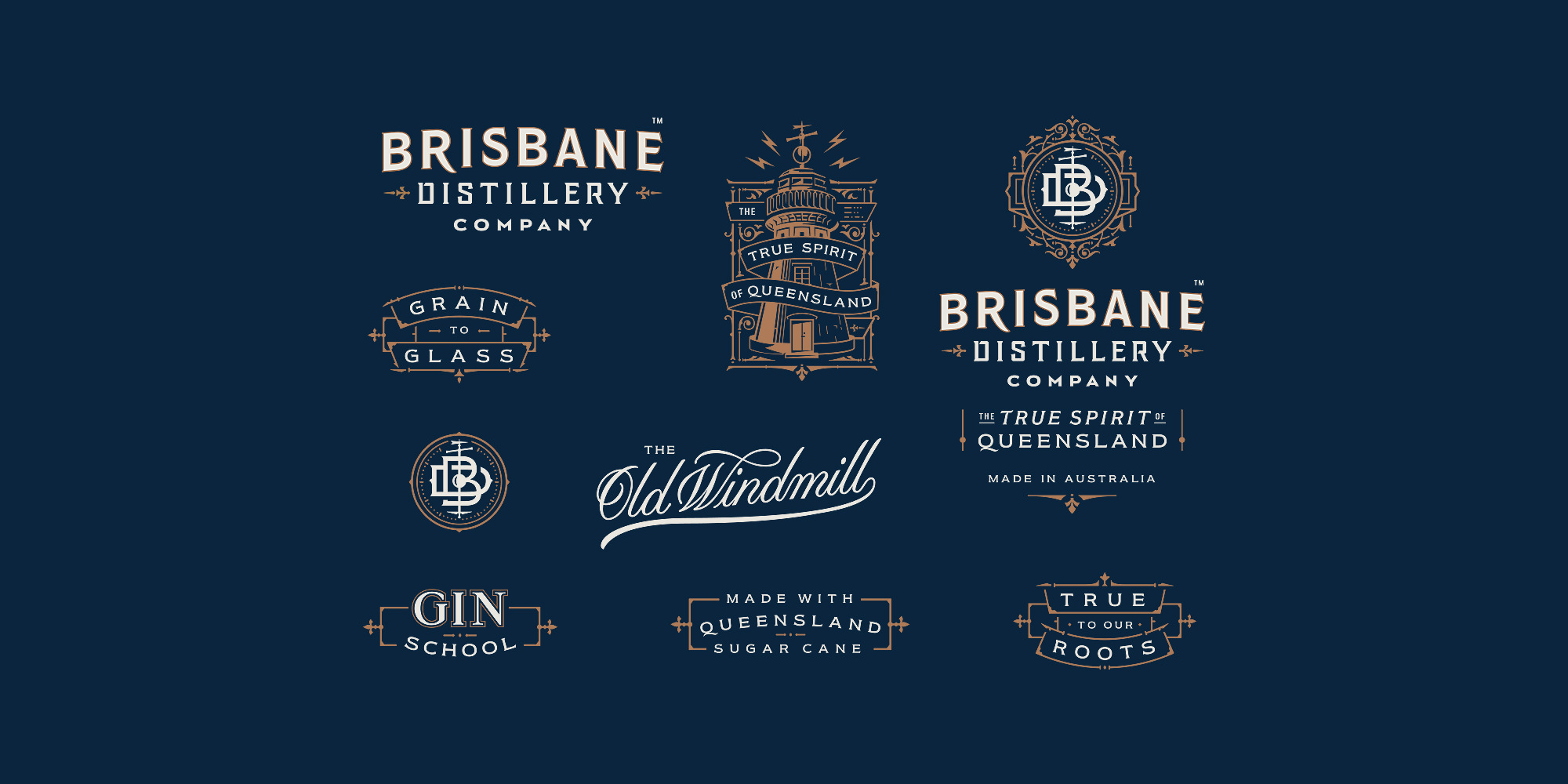
All the lettering and illustrations have been custom drawn. Light and shadow were used with dark paper colour in mind to emphasise the main forms. Like the old, stone windmill itself, the text and line work is deliberately solid in order to feel trustworthy. Although we worked from historical references, I aimed to give it a timeless quality – clear and strong with a touch of elegance.
Implementing the identity
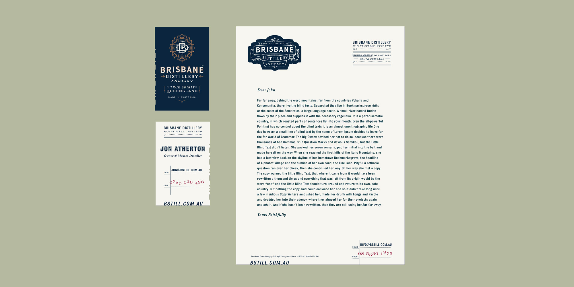
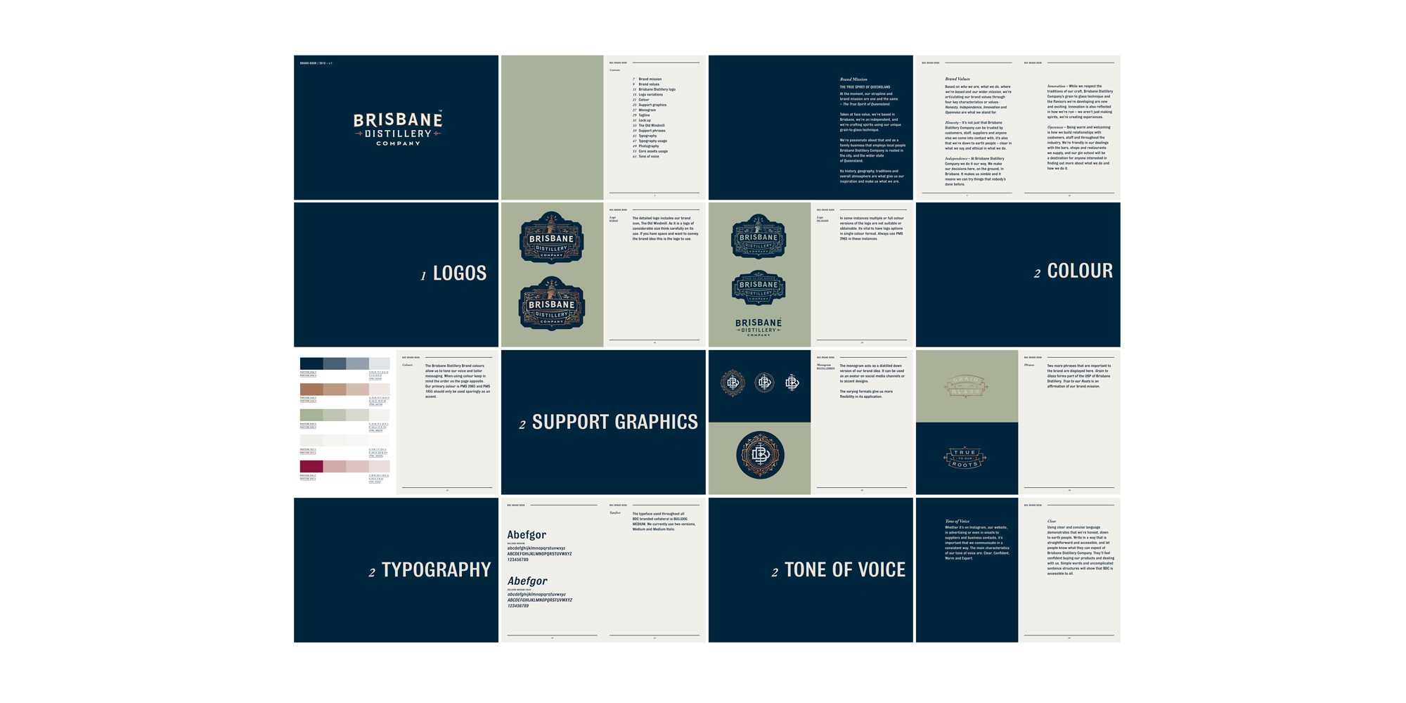
Beyond the brand design work, we supported the client in its implementation. I put together a brand book for Jon, and asked Garrick to write the text demonstrating the Brisbane Distillery Company’s unique tone of voice and articulating the brand values that informed the entire project.
With such a wide range of products planned, I wanted to equip Brisbane Distillery Company with imagery to promote them before finished products were available to photograph. To do this, Jon commissioned CreativeCarbon to create photoreal 3D renders of a whole variety of gin, rhum and vodka bottles in appropriate settings. This way BDC is able to begin its marketing initiatives and start promoting its gin school from the word go.
A sign has been made for the distillery itself, with further graphics for the gin school, and I’ve designed an exhibition stand for the company to take to trade shows. Stationery has been printed, and a social media narrative has been prepared for the rollout of the brand.
The result
Our work for Brisbane Distillery Company marks a progression in how we realise brands for clients. This is a fully-considered, well-rounded identity with a versatile packaging system that cost-effectively yet elegantly covers a wide product range, which can be easily extended as new liquors are released. It’s a brand that will make an instant impact in Australia, but is outward looking and ready for export as well.
Brisbane Distillery Company’s look and feel is down-to-earth like the guys distilling the alcohol, but also intricate and sophisticated like the flavours they are crafting. It’s been an extremely exciting project and I can’t wait to see the bottles appearing in bars and retail.
“We’re beyond ecstatic with the result, a perfect foundation for us to build our business on. Great work mate. 👍🏼”
Jon Atherton, Founder, Brisbane Distillery Company